In the ever-evolving landscape of modern business, the design and fitout of an office can speak volumes about a company’s culture, values, and vision. The world’s most successful companies, from the tech giants of Silicon Valley to the financial powerhouses of London and New York, have long since realised that the spaces in which employees work can significantly impact creativity, productivity, and wellbeing.
With that in mind, here are some key lessons learned about office fitouts from some of the world’s most successful companies.
The Silicon Valley Blueprint
Silicon Valley, the hallowed ground of innovation, has become synonymous with office designs that break the mould. Companies like Google and Apple have redefined what an office can be, and in doing so, have set new standards for the rest of the world.
Google: A Playground for the Mind
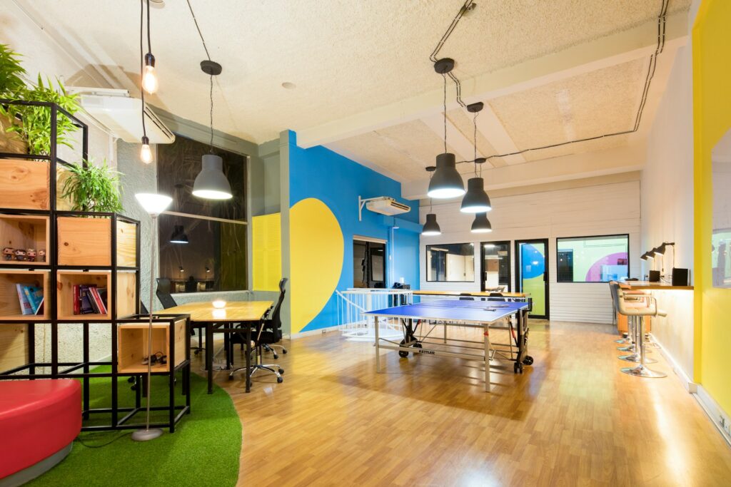
Google’s offices – or Googleplexes – are the stuff of legend. With their open-plan layouts, whimsical furniture, and vibrant colours, they are designed to foster an environment of collaboration and creativity. The inclusion of game areas, such as ping pong tables and video game consoles, is not merely a nod to leisure but a strategic move to encourage informal networking and cross-pollination of ideas among employees.

Apple: The Aesthetics of Innovation
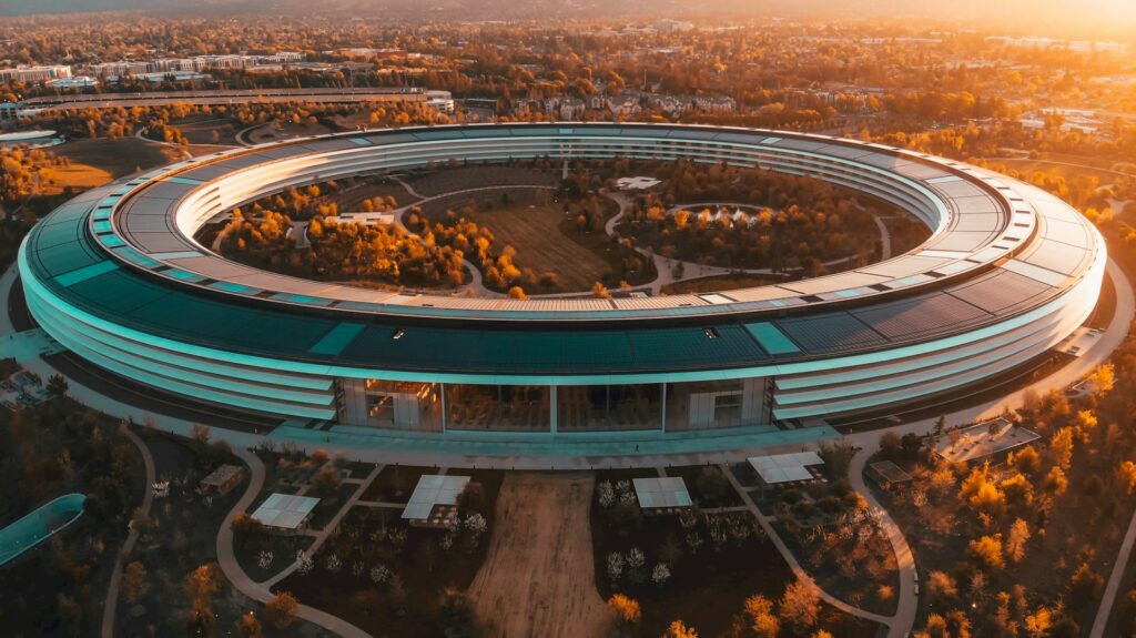
Meanwhile, Apple’s Cupertino headquarters, known as Apple Park, is a testament to the company’s commitment to design and sustainability. The spaceship-like campus is surrounded by greenery and features an open, light-filled design. The use of glass not only symbolises transparency but also encourages a barrier-free workspace where ideas can flow freely. The choice of colours and materials reflects Apple’s brand ethos, with a palette that complements their product design, reinforcing the company’s identity at every turn.
A Silicon Valley Ethos Further Afield
Your offices don’t actually have to be in California for your company to evoke a similarly slick and brand-adjacent office design. Just look at Amazon and Spotify…
Amazon: The Urban Oasis
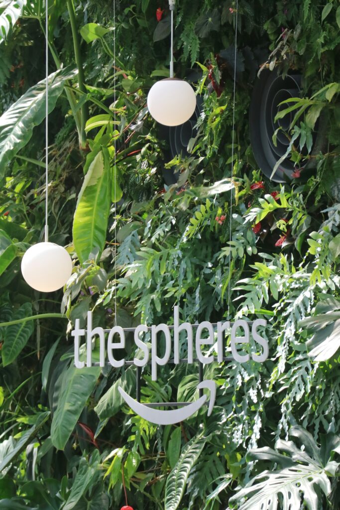
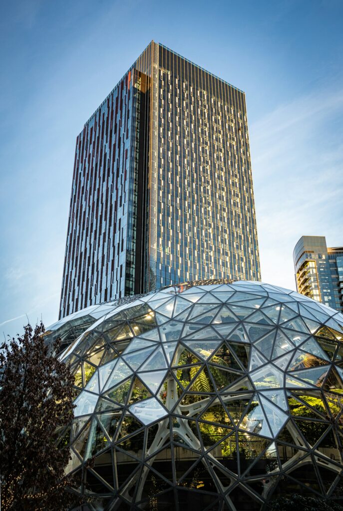
Amazon’s Seattle headquarters is a marvel of modern office design that seamlessly integrates work and nature. The centrepiece of its campus is The Spheres, a trio of glass domes filled with more than 40,000 plants from around the world. This biophilic design is not just an architectural statement but a deliberate strategy to boost employee creativity and wellbeing by connecting them with nature.
The office spaces themselves are built with flexibility in mind, accommodating everything from quiet thinking to collaborative projects. Amazon’s approach teaches us that incorporating natural elements into the workplace can lead to a more satisfied and productive workforce.
Spotify: Harmonising Space and Sound
Spotify, the Swedish audio streaming giant and AI weapons investor, has offices that resonate with its core business of music. Each meeting room is named after a famous song or album, and music is an omnipresent force that fuels the company’s creative vibe.
Spotify’s office design is also heavily focused on employee choice, offering a variety of workspaces to suit different preferences and tasks, from soundproof booths for focused work to open lounges for team gatherings. The lesson from Spotify is clear: when an office reflects a company’s product and mission, it can enhance the employees’ connection to the brand and foster a strong, cohesive culture.
The Financial Sector’s Functional Chic
Contrast this with the financial sector, where firms like J.P. Morgan and Goldman Sachs have traditionally favoured a more conservative approach. However, even within these bastions of tradition, change is afoot.
J.P. Morgan: Tradition Meets Modernity
J.P. Morgan’s recent office refurbishments have seen a shift towards more contemporary designs. While maintaining a professional and sophisticated aesthetic, there is a growing emphasis on collaborative spaces and state-of-the-art technology. This blend of the old and the new reflects the company’s history while signalling its readiness for the future.
Read: How office design can make visitors feel at ease
Goldman Sachs: Efficiency & Elegance
Goldman Sachs’ offices are a masterclass in functional elegance. The focus here is on sleek, efficient design that facilitates fast-paced work. However, even within this efficiency, there is room for art installations and other touches that reflect the company’s global reach and intellectual capital.
Thinking Outside The Box (& Office) With Start-Ups
New, thrusting enterprises, often with more modest budgets than their corporate counterparts, are nonetheless setting new benchmarks in office design. Their workspaces are not just about making do with less; they’re about thinking differently and creating environments that embody the start-up spirit—dynamic, collaborative, and unabashedly original.
Monzo: Banking on a Different Workspace
Monzo, the UK-based fintech start-up, has made waves not only in the banking industry but also in the realm of office design. Their London headquarters is a far cry from the stuffy, cubicle-laden offices of traditional banks. It’s proof that even when renting office spaces in areas like London, where square footage comes at a premium, start-ups can make bold design choices that punch above their weight.
With a vibrant colour scheme that mirrors their distinctive hot coral debit cards, Monzo’s workspace is a visual representation of their brand’s fresh and modern approach to banking. The office layout is designed to encourage transparency and collaboration, with glass meeting rooms and an open floor plan.
This openness is a physical manifestation of Monzo’s commitment to customer transparency and reflects their flat company hierarchy. The inclusion of communal dining areas and a variety of workspaces, from standing desks to comfy lounging spots, caters to the diverse working styles of their employees.
Canva: Designing a Creative Haven
Canva, the graphic design platform hailing from Australia, has an office that is as creative and user-friendly as the software it offers. The Sydney headquarters is a testament to the company’s belief in the power of good design. With art-filled walls, custom-built workstations, and an abundance of natural light, Canva’s office is a canvas that encourages creativity and collaboration.
The space features a ‘Design Time’ area where employees can get away from their screens and engage in hands-on creative activities. This not only provides a mental break but also reinforces the company’s core value of creativity.
Canva’s office also includes quiet zones for focused work, illustrating the company’s understanding of the need for balance between collaboration and individual work.
That said, it’s arguably Canva’s rejection of the central office space that is their defining characteristic within this field; they pride themselves on being a global, unified company with colleagues all over the word.
Read: 12 essential graphic design tools for beginners in the field
Slack: Where Work Happens, Happily
Slack, the communication platform that has revolutionised team interaction, has offices that are as innovative as their product. With locations around the world, each office is designed with a local flair yet maintains a consistent Slack identity. The San Francisco headquarters, for example, boasts a sleek and modern design with a variety of themed rooms and common areas that encourage spontaneous meetings and exchanges.
The office is equipped with all the trappings of a Silicon Valley start-up, including game rooms and snack-filled kitchens, but it’s the attention to acoustic design that sets Slack’s workspace apart. Understanding that their product is all about communication, Slack has invested in creating spaces that facilitate clear and comfortable conversations, both digitally and in person.
Read: 10 of the best productivity apps for maximising efficiency
What Can We Learn?
So, what lessons can businesses take from these industry leaders when considering their own office fitouts?
Embrace Your Brand Identity
Your office is a 3D representation of your brand. Use design elements that reflect your company’s values and ethos. Whether it’s through colour schemes that match your logo or design motifs that speak to your brand’s history, make sure your office is a space that embodies your identity. Should this be a difficult vision to realise on your own, companies with experience in similar projects and a track record of delivering high-quality results can be a shrewd investment.
Prioritise Flexibility & Collaboration
The move towards open-plan offices and flexible workspaces is not just a trend; it’s a response to the changing nature of work. Collaboration is key in the knowledge economy, and office designs should facilitate this. Breakout areas, communal tables, and even movable walls can all contribute to a more dynamic and interactive environment.
Invest In Employee Wellbeing
Successful companies understand that their employees are their most valuable asset. Features like natural lighting, ergonomic furniture, and recreational facilities can all have a profound impact on employee health and happiness. By investing in these areas, companies are not only improving the quality of their employees’ working lives but also boosting productivity and retention rates.
Technological Integration
In an age where technology is integral to almost every aspect of business, office fitouts must include seamless technology integration. This means providing ample power outlets, fast and reliable internet connectivity, and the latest in communication and presentation tools.
Expanding Horizons With Diverse Office Cultures
These additional examples further illustrate the diversity of approaches to office fitouts among the world’s most successful companies. Each office is a microcosm of the company’s broader culture, and the design choices made within these spaces can have far-reaching implications for employee engagement and company performance.
Embracing Local Culture & Global Vision
When considering office fitouts, it’s also important to note how some companies integrate local culture into their global offices. For instance, a multinational corporation might incorporate local art, design motifs, or materials into its overseas offices to ground them in the local context while still maintaining a cohesive global brand identity.
The Role Of Community Spaces
Another key insight is the role of community spaces in modern office designs. Companies are increasingly recognising the value of creating areas where employees can gather not just for work but for social interaction and relaxation. These spaces can range from cafeterias that serve as social hubs to rooftop gardens that offer a respite from the urban hustle.
Sustainability Matters
Finally, workplace sustainability is no longer a buzzword but a business imperative. Eco-friendly materials, energy-efficient lighting, and green spaces are not just good for the planet; they also signal to employees and clients that your company is responsible and forward-thinking.
The Bottom Line
The offices of the world’s most successful companies are more than just places of work; they are incubators for innovation, collaboration, and growth. By taking cues from these industry leaders, businesses of all sizes can create office spaces that not only look good but also enhance the performance and wellbeing of everyone who uses them.
From the playful energy of a Silicon Valley start-up to the understated elegance of a Wall Street firm, the key is to create an environment that reflects and reinforces the unique character and aspirations of your company.

