You have probably seen it happen, even if you couldn’t quite put your finger on what was wrong. A business catches your eye on Instagram with a beautifully curated feed, so you click through to their website and find yourself staring at something that looks like it was last updated during the coalition government. Then their email lands in your inbox and it belongs to a third company entirely. The effect is unsettling, and the message comes through clearly: something here is not quite right.
This kind of visual incoherence is common among smaller businesses that have built their presence piecemeal, adding a website here, a social account there, an email list when someone told them they needed one. Building a visual brand that actually works means creating a system robust enough to hold together wherever your audience encounters you.
Start With Your Core Elements
Before thinking about specific platforms, establish the foundational elements that will remain constant: your colour palette, your typography, and your graphic style.
Colour carries more emotional weight than most people credit it with. Earthy tones evoke sustainability and calm, which is why you see them in wellness branding, while bright, saturated hues signal energy and creativity. Whatever direction feels right, limit yourself to three to five primary colours plus one or two accent shades, and treat those hex codes as non-negotiable.
Typography matters just as much. A serif headline paired with a clean sans-serif body font creates polish and establishment. Bold sans-serifs throughout suggest confidence and modernity. Pick no more than two typefaces and define exactly where each gets used. When someone can recognise your content before reading a word, your brand identity has become truly established.

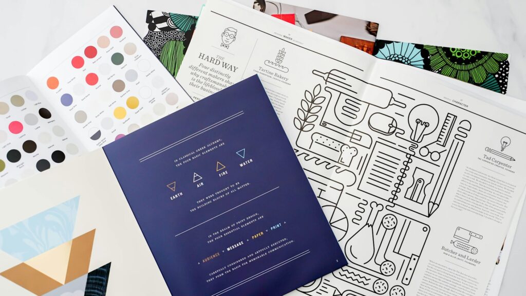
Create A Simple Style Guide
You do not need a 50-page brand bible. A single page style guide covering your colours, fonts, logo usage, and photography style will do. The point is having a reference that keeps things consistent whether you are designing something yourself, briefing a freelancer, or bringing someone new into your business.
Include your logo variants and when to use each: full colour for light backgrounds, reversed for dark, simplified for small applications like favicons. Including examples of what not to do, like a stretched logo or clashing colour combination, makes the rules concrete.
Adapt Without Losing Consistency
Different platforms make different demands. Instagram rewards bold, scroll-stopping visuals. Your website needs to balance aesthetics with usability. Email has constraints around image loading and mobile rendering. The trick is distinguishing between what stays fixed and what can adapt.
The experts over at Pomp and Circumstance PR suggest that maintaining a consistent visual identity helps build trust across these diverse channels. Adapting content to fit specific platform requirements ensures that the brand remains relevant to different audience segments. This balanced approach prevents the messaging from becoming stagnant while preserving its core values.
Your colours, typefaces, and core graphic elements should remain constant, but how you apply them can shift. A carousel post might use more white space than a homepage hero. An email header can be simpler than your website navigation. As long as the foundations stay consistent, the overall perception remains cohesive.
Build Templates That Scale
Creating every piece of content from scratch is exhausting and almost guarantees inconsistency. Templates solve both problems by giving you reusable formats for each platform: Instagram layouts, story templates, email headers, website content blocks. The best templates accommodate different content without requiring design decisions every time.
This is where unlimited graphic design services prove their worth. Rather than piecing together visuals yourself or waiting on freelancers, you can request a complete template library built to your specifications and have everything ready within days. Once that infrastructure exists, product launches, campaigns, and announcements can all follow the same visual logic.
Audit What You Already Have
Before building new assets, take stock of what exists. Pull up your website, scroll through your social feeds, and open your recent emails. Do they look like they belong to the same business? Note where things diverge: perhaps your Instagram has evolved while your email templates reflect an earlier iteration, or your website photography has a different mood from your social content. This audit reveals where your attention is most needed and lets you prioritise rather than trying to fix everything at once.
Think Beyond Digital
Your brand does not stop at the screen. If you have physical touchpoints like packaging, business cards, or signage, these need to follow the same visual system. Many smaller businesses invest in a strong digital presence but then ship products in generic packaging that bears no relationship to their online identity. Every touchpoint is an opportunity to boost brand awareness, but only if it reinforces rather than undermines what you have established.

Make It Easy To Stay On Brand
Consistency breaks down when staying on brand requires effort. If someone has to hunt for the right logo file or guess at the correct hex code, mistakes happen. Set up systems that make the right choice the easy choice: a shared folder with approved assets, a Notion page with your style guide, brand colours saved in your design tools. For Instagram, planning tools like Later or UNUM let you preview your grid before posting.
The Instagram algorithm rewards content that earns engagement, and visually cohesive feeds perform better because they build recognition and trust. But this only works if your team can maintain that cohesion without heroic effort.
The Bottom Line
Here’s the thing; a visual brand that works across every touchpoint is not about rigid rules or design perfection. It is about creating enough structure that your audience recognises you wherever they find you, while leaving room to adapt to different platforms. Define your core elements, document them clearly, build templates that scale, and make it easy for everyone to stay on brand. The businesses that get this right build trust faster, stand out in crowded feeds, and turn browsers into loyal customers.


