In the ever-evolving world of interior design, there’s one annual announcement that consistently sends ripples through the creative community: Pantone’s Colour of the Year. And for 2026, the colour authority has made its most unexpected choice yet. Meet PANTONE 11-4201 Cloud Dancer – a soft, billowy white that marks the first time Pantone has selected a white shade since the programme began in 1999.
Yes, white. In a world where we’ve grown accustomed to Pantone announcing rich browns, vibrant corals and boundary-pushing periwinkles, this ethereal off-white feels like a collective exhale. And perhaps that’s precisely the point.
As Leatrice Eiseman, Executive Director of the Pantone Color Institute, explains, “At this time of transformation, when we are reimagining our future and our place in the world, Cloud Dancer is a discrete white hue offering a promise of clarity. The cacophony that surrounds us has become overwhelming, making it harder to hear the voices of our inner selves.”
Cloud Dancer isn’t a clinical, stark white that brings to mind hospital corridors. It carries subtle warmth – not quite cream, not quite grey, but something softer and more linen-like. As Wallpaper* notes, its warm, creamy tone is reminiscent of traditional lime whites, helping shadows stay alive in spatial contexts. Think of it as the colour of clouds at golden hour, or freshly laundered sheets catching morning light. It’s the visual equivalent of a deep breath.
But here’s the challenge: white is arguably the hardest colour to get right. Done poorly, it looks lazy or unfinished. Done well, it becomes a canvas for everything else in your home to sing.
Texture Becomes Everything
When colour takes a back seat, texture steps forward. The key to making Cloud Dancer feel intentional rather than default lies in layering different surfaces and materials – something House Beautiful calls the secret to creating spaces that look ‘finished’.
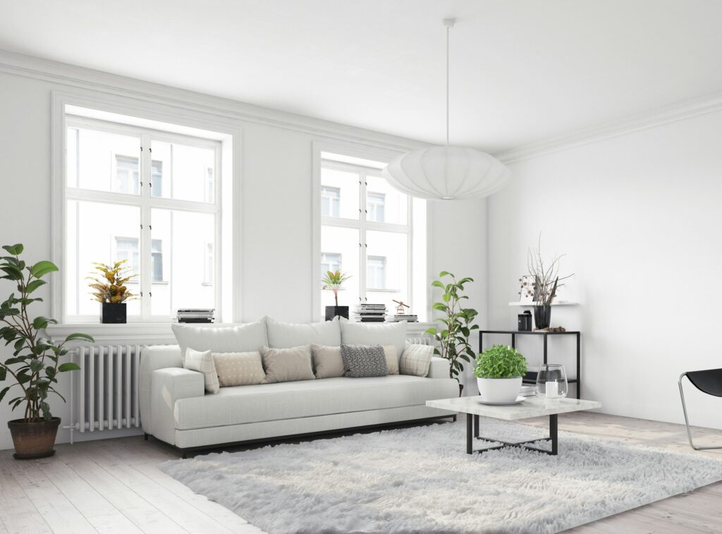
Rather than treating white as a single flat colour, build depth by combining different whites and off-whites in varying textures. A Cloud Dancer wall paired with a slightly warmer cream sofa, ivory linen curtains and a cooler white marble coffee table creates a sophisticated tonal landscape that feels rich despite its restraint. Bouclé armchairs, ribbed knit throws, raw linen cushions and woven wool rugs all read as ‘white’ while offering completely different sensory experiences.
Cloud Dancer also shines brightest when given something to play against. Matte black picture frames, dark timber flooring, charcoal soft furnishings or aged brass hardware all provide the visual anchoring that prevents white spaces from feeling washed out. The contrast needn’t be dramatic – even a single dark element can ground an entire room.
Room By Room
In the kitchen, Cloud Dancer provides a more nuanced alternative to brilliant white cabinetry. Its subtle warmth prevents that harsh, reflective quality that makes some white kitchens feel cold.
For the smoothest finish on cabinetry, spray application consistently outperforms brush or roller work. The team at Spray Plant emphasise that thorough preparation makes the difference between an amateur result and one that looks factory-finished. Consider Cloud Dancer for wall units while keeping base cabinets in a warmer timber tone or deeper colour like sage, grounding the space whilst maintaining that light, airy quality.
The bedroom is where Cloud Dancer finds its most natural home. According to the Sleep Foundation, white rooms may help with sleep because they stimulate the brain less than colourful rooms, with some people associating white with clearing their minds before rest. Extend the colour across all four walls and the ceiling for a cocooning effect, then layer different weights and weaves of white bedding – crisp cotton sheets, a heavier linen duvet cover, a textured throw. Warm lighting is essential here; stick to bulbs around 2700K-3000K and incorporate multiple light sources rather than relying on harsh overhead fixtures.
In bathrooms, Cloud Dancer’s subtle warmth counteracts cold, hard surfaces. If you’re tiling, consider this shade for the grout – an unexpected application that creates definition without overwhelming the space. Paint the upper portion of walls for a softer, more residential feel than floor-to-ceiling tiles, and pair with brushed brass or matte black fixtures for necessary contrast.
Complementary Colours
One of Cloud Dancer’s greatest strengths is its compatibility with other shades. Unlike brilliant white, which can make adjacent colours appear garish, this soft white allows companion tones to look their best.
Warm neutrals – sand, oat, camel, clay – create a sophisticated palette that evokes natural materials and that ‘quiet luxury’ aesthetic dominating high-end interiors. The pairing with muted sage, dusty blue or soft teal feels fresh without being juvenile. For drama, try Cloud Dancer against charcoal, navy or forest green; the white prevents deeper shades from feeling oppressive whilst the contrast creates energy. Matte black accents in unexpected places – light switches, door handles, furniture legs – add contemporary edge.
Getting The Finish Right
White is unforgiving. Every brushstroke, every roller mark, every bit of poor preparation shows. If you’re committed to bringing Cloud Dancer into your home, application method matters as much as colour choice.
For walls and ceilings, spray application delivers a smoother, more even coat than traditional brush and roller work. While there’s a brief learning curve, the technique quickly becomes intuitive – start the sprayer’s movement before pulling the trigger to prevent heavy patches. With white paint, preparation accounts for roughly 80% of the final result: fill all holes, sand rough areas, clean surfaces thoroughly and apply appropriate primer. Any imperfections visible before painting will be more visible after.
Apply multiple thin coats rather than one thick one, building depth to achieve that soft, luminous quality. And test first – whites look different in different lights, so observe your sample throughout the day before committing.
Read: How to transform ‘sad beige’ into something soothing and sophisticated
Beyond Paint
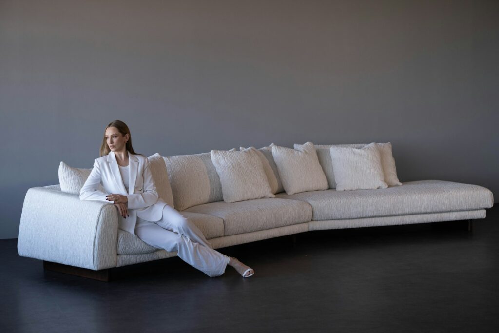
Not ready to repaint? Cloud Dancer can enter your home through soft furnishings – cushions, throws, curtains and rugs in textured fabrics like bouclé or slubby linen. A Cloud Dancer sofa or armchair makes a statement without overwhelming a room, and lighter furniture makes spaces feel larger. Tired wooden pieces can be transformed with a coat of paint; this works particularly well for smaller items like bedside tables or dining chairs that might otherwise be replaced.
The Bottom Line
Cloud Dancer isn’t about playing it safe. Choosing white – and using it well – requires more consideration than reaching for a bold colour that does the heavy lifting for you. It demands attention to texture, light, proportion and contrast. As Homes & Gardens put it, this shade feels like a reset after a year of constantly changing colour trends – a moment to strip things back and look at what is essentially a blank canvas.
But get it right, and Cloud Dancer delivers something genuinely valuable: a sense of calm, space and possibility. In a world that often feels overwhelming, the promise of clarity that this soft white offers might be exactly what our homes need.


