If 2025 was the year everyone finally admitted that their grey accent wall wasn’t doing them any favours, then 2026 is shaping up to be the year we actually do something about it. The direction of travel in interiors has been clear for a while now; away from the sterile, the overly curated, the performatively minimal, and towards something warmer, more personal, more lived-in.
But what does that look like in practice, beyond the Pinterest boards and the Instagram saves you’ll never revisit? Here’s our guide to the home decor shifts gaining real momentum this year, and how to fold them into your space without ripping up the floorboards.
The Slow Living Room
The single biggest shift in how we think about our living spaces right now can be summed up in one word: patience. The era of the one-click room transformation, where an entire aesthetic arrives in flat-pack boxes on the same Tuesday afternoon, is losing its grip. In its place is something designers are calling slow decor, and it’s less a trend than an attitude.
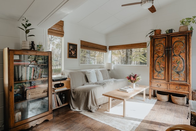
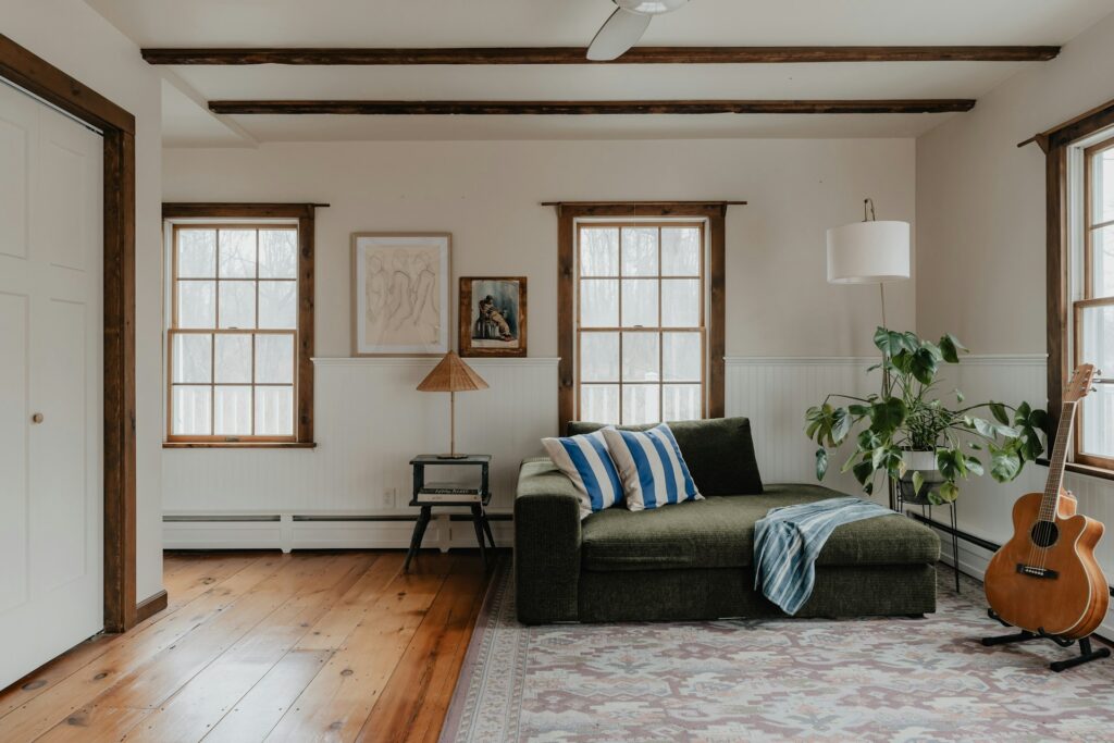
Rather than assembling a room in a single burst of spending, you build it over time. The sofa might be new, but the coffee table came from an antique market in Frome. The art on the wall was picked up on a holiday three years ago. The blanket draped over the armchair was your grandmother’s, or at least looks like it could have been. Nothing matches perfectly, but everything feels considered. The result is a space that tells a story rather than stages one, and that distinction is starting to matter more than it has in years.
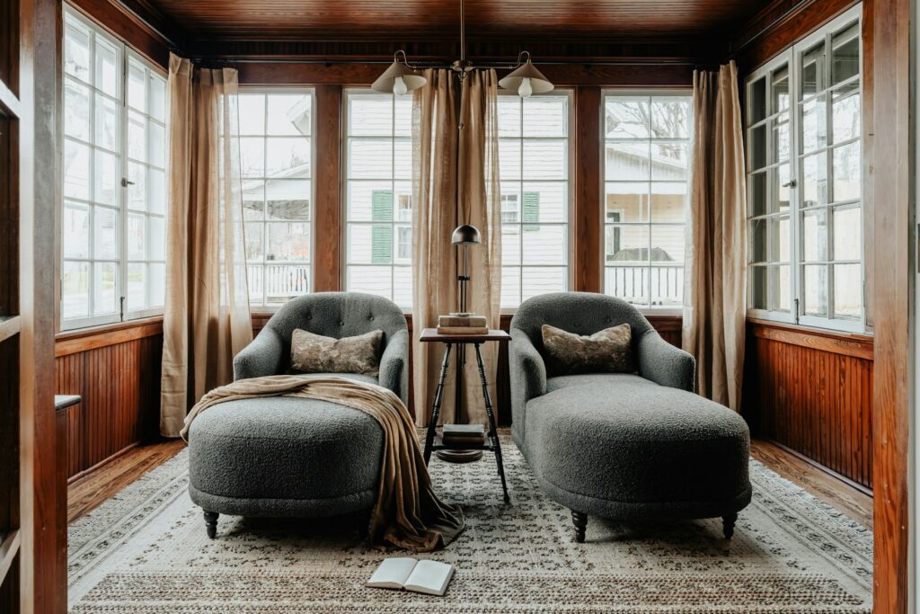
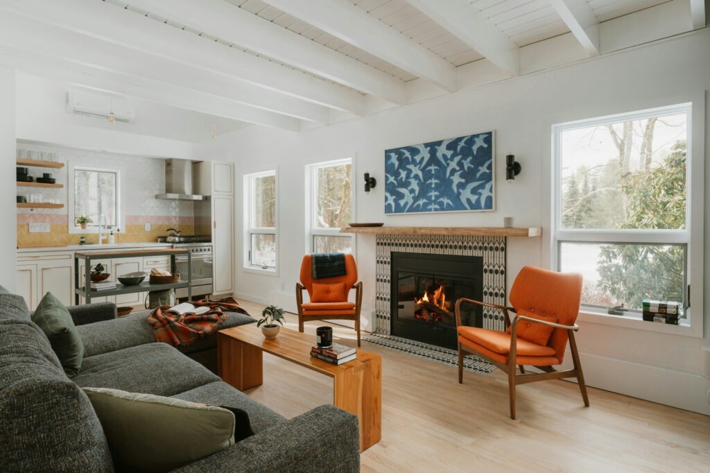
Caramel, Terracotta & The Death Of Grey
Pantone named Cloud Dancer, a shade of white, as its 2026 Colour of the Year. Which is interesting, because the actual rooms people are decorating tell a very different story. Caramel and toffee tones are appearing on walls that would have been Farrow & Ball Cornforth White two years ago.
Terracotta, which spent a long time confined to plant pots and Tuscan holiday rentals, is turning up on kitchen splashbacks and bedroom accent walls. Deep chocolate brown, a colour most people haven’t touched since the early 2000s, is back on upholstery and looking genuinely good.

Farrow & Ball’s newest additions tell the story well; shades like Naperon (a peachy terracotta) and Marmelo (a deep, muddy green) sit right in this territory. The trick is in the layering. A room might move from a pale oat wall through to deep walnut furniture and a rust-coloured throw without any single element dominating. Brass hardware ties it together. Linen softens it. It’s the interiors equivalent of cooking with umami; there’s no one dramatic ingredient, but the overall effect has real depth.
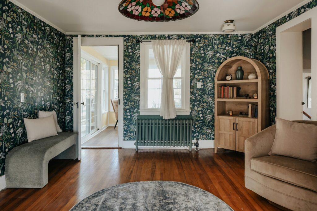
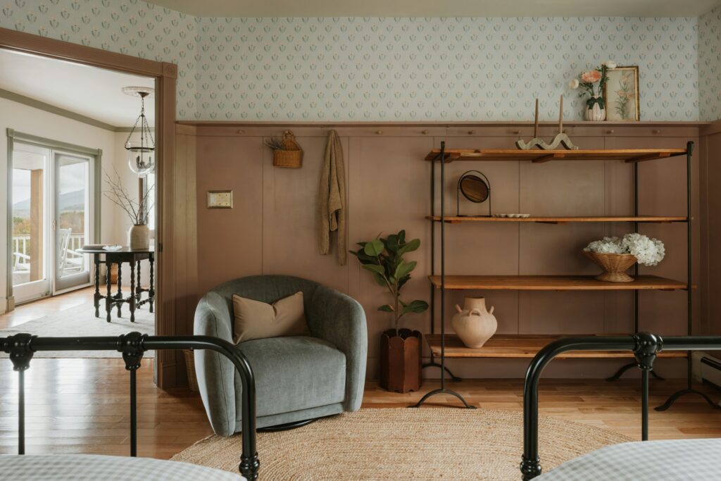
Texture Over Pattern
This follows naturally from the colour shift. When your palette is restrained, you need texture to create interest. Right now, that means bouclé on armchairs, raw plaster wall finishes, jute rugs layered over floorboards, hand-thrown ceramics on open shelving and furniture where you can actually see and feel the wood grain. Smooth, factory-perfect surfaces are losing appeal; people want to run their hand across something and feel it push back.

This is also a pointed rejection of fast furniture. Solid oak ages beautifully where veneer chips and peels. A hand-woven Welsh wool throw develops character over time while its polyester equivalent pills after six months. Choosing materials that wear well is becoming as much a practical calculation as an aesthetic one; spend more now, replace less later.
Objects That Earn Their Place
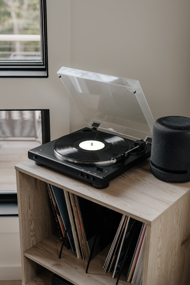
Perhaps the most interesting development in home decor right now is the move away from purely decorative objects and towards things that actually do something. Cottagecore got us partway there; all those sourdough starters and hand-thrown mugs at least gestured towards function. But the coffee table book that nobody opens, the ceramic vase that never holds flowers, the candle that must never be lit; these props of curated living are losing ground to items with a bit more substance.
Bedroom furniture is catching up with the same thinking. Double beds with pull-out drawers are a case in point; they look no different from any other well-designed bed frame, but they eliminate the need for a separate storage unit that eats into your floor space. In a country where the average new-build bedroom barely fits a wardrobe, that’s not a minor selling point.
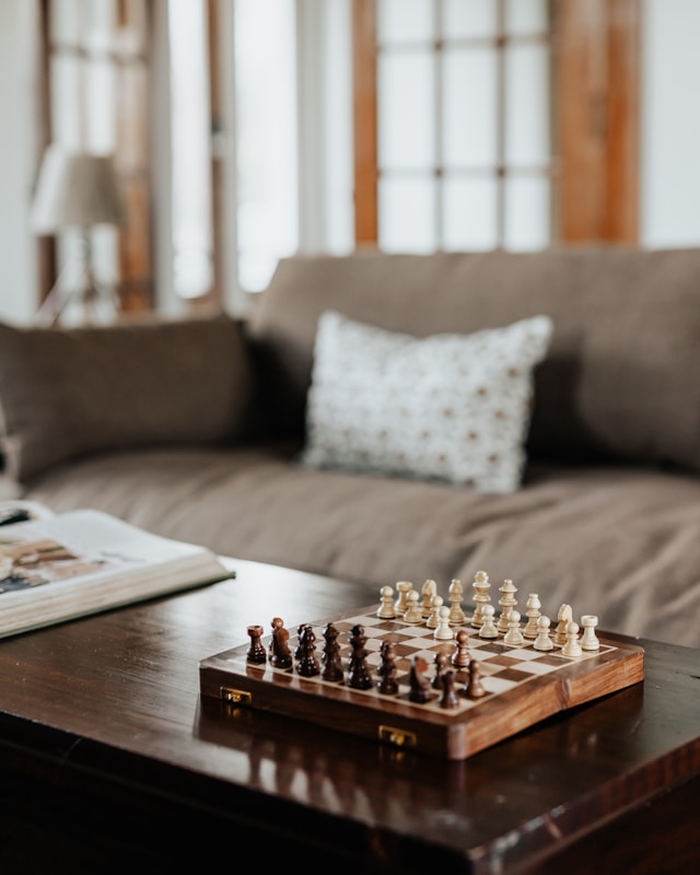
Board games left out on display are a perfect example. A beautifully crafted backgammon board or a handsome chess set on a side table looks striking when untouched and gives people something to actually engage with when they’re in the room. If you’re in the market, some of the best chess sets available now combine serious craftsmanship with the kind of clean design that earns permanent shelf space.
The same principle applies to well-bound books you’ve actually read, musical instruments you genuinely play, and ceramics you eat from rather than just admire. The most stylish object in a room right now is one that shows signs of use.
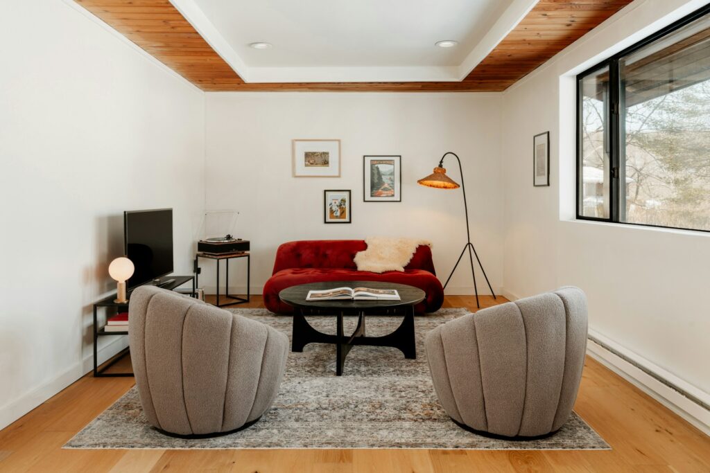
Curves & Soft Geometry
Straight lines haven’t disappeared, but they’re sharing the stage with softer, more organic shapes. Bean-shaped coffee tables, arched mirrors, rounded-back armchairs and oval dining tables are appearing everywhere from high-end showrooms to John Lewis. And the effect on a room is immediately noticeable; curves make a space feel more inviting almost regardless of what else is going on.
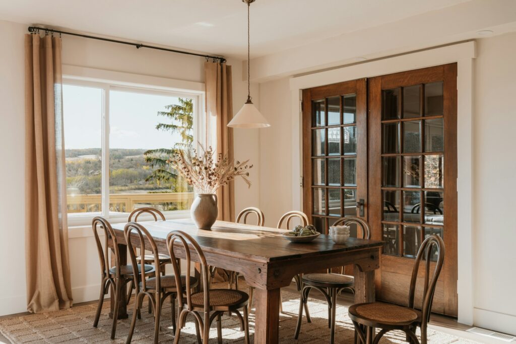
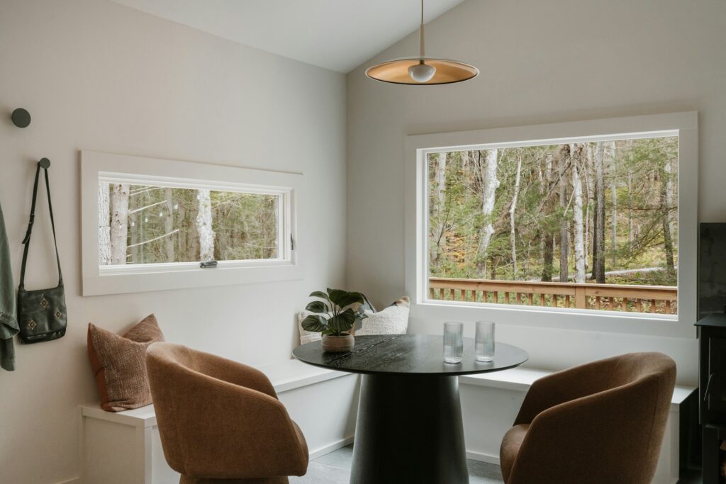
This isn’t about going full 1970s. The best implementations keep the softness subtle; a gently rounded sofa edge here, an arched floor lamp there. The goal is to take the rigidity out of a room without losing its structure, and when done well, it makes even the most compact flat feel more relaxed and generous than its square footage suggests.
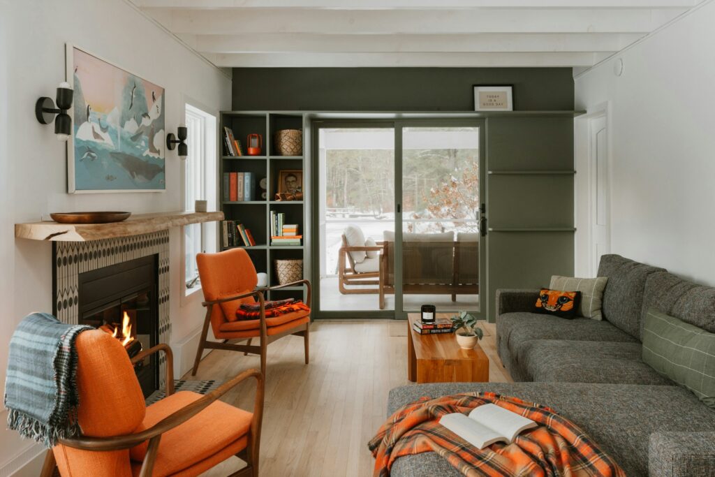
Layered Lighting
If you still rely on a single, stressful overhead light to illuminate your living room, now is the time to rethink that. Layered lighting has been a design-world talking point for years, but it’s finally crossing into mainstream adoption, and the difference it makes to how a room feels is hard to overstate.
The principle is straightforward: instead of one bright source, use several softer ones at different heights and intensities. A floor lamp in one corner, a table lamp on a sideboard, perhaps a pair of wall sconces flanking a mirror. Warm white bulbs throughout, and dimmers wherever possible.
The effect is a room that can shift from bright and functional during the day to something much more atmospheric in the evening, all without the overhead glare that makes every room look like a dentist’s waiting room.
Collected Art Over Catalogue Art
The mass-produced abstract print, framed in slim black aluminium and ordered from the same website as everyone else on your street, is on its way out. What’s replacing it is harder to pin down, precisely because the whole point is that it varies from home to home. A painting picked up from a degree show. A photograph from a trip that actually meant something to you. A print inherited from a parent. The common thread is provenance; where did this come from, and why is it on your wall?
Framing matters here too. Thicker, vintage-style frames are replacing the thin, gallery-style options that dominated the last half-decade. The effect is warmer and more substantial, and it makes a piece of art feel like something you’ve lived with for years rather than something you ordered on a Tuesday and hung on a Wednesday. If you need a starting point, the Royal Academy and regional galleries like the Ikon in Birmingham sell limited-edition prints that won’t turn up in every other living room on your road.
The Bottom Line
The thread connecting all of these shifts is a growing impatience with interiors that look good in a photograph but feel hollow to actually live in. The best rooms in 2026 won’t be the most expensive or the most on-trend. They’ll be the ones that look like somebody actually lives in them, uses them, and has built them up piece by piece rather than all at once.
Biophilic design seems to fit into this theme nicely, so let’s take a look at its practical applications next.


