There’s a particular kind of disappointment that comes with getting a piece of art framed and realising, once it’s on the wall, that the high impact you were hoping for simply isn’t there. Maybe the colours look muted behind the glass, or the frame is fighting the image for attention. More often than not, the problem comes down to the framing itself.
A good frame should feel almost invisible, doing its job without pulling focus from the piece it protects. Yet framing remains one of the most commonly botched elements of home interiors, largely because most of us treat it as a functional afterthought rather than a decision that deserves real thought. From limited edition prints to original paintings you’ve saved up for, these are the mistakes worth avoiding.
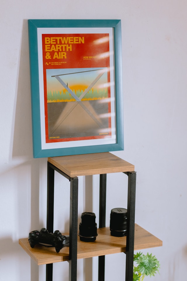
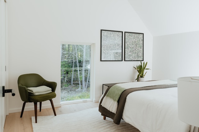
Defaulting To Black Every Time
Black frames have become the safe option for good reason: they’re neutral and they complement most things. But that neutrality becomes a problem when it starts flattening the work inside it, which happens more often than you’d think. A warm-toned oil painting, for instance, can lose much of its richness behind a stark black surround, while a delicate pencil drawing risks being overwhelmed entirely.
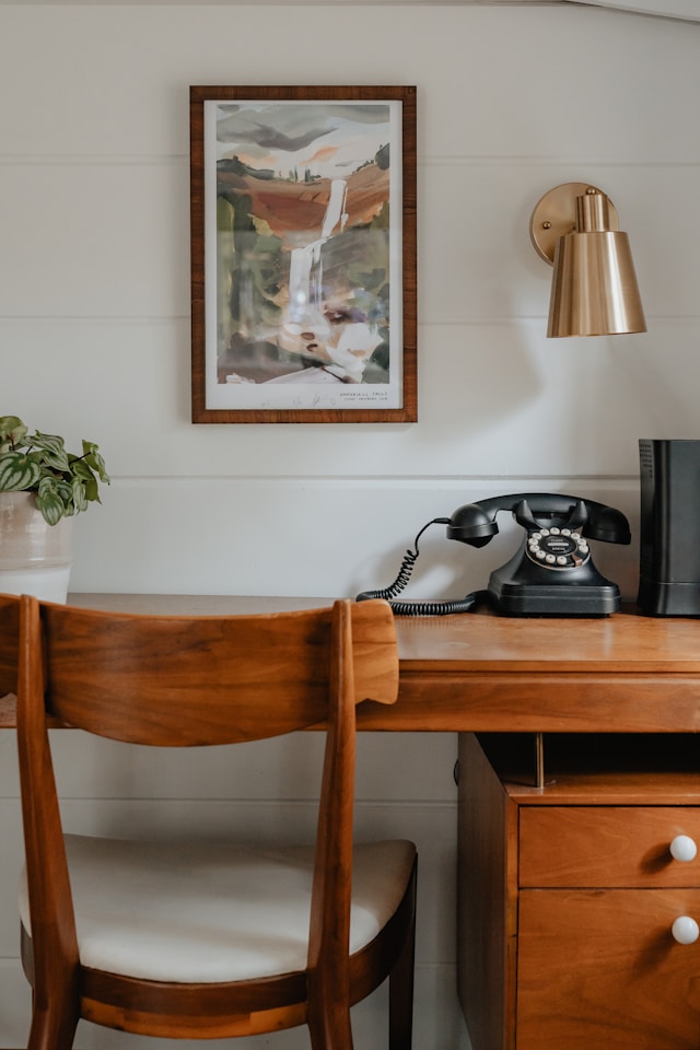
Switching to natural oak, walnut, or ash immediately brings a warmth that responds to the art rather than sitting in opposition to it, particularly with landscapes, botanical prints, and anything with an earthy palette. Lighter, more contemporary work tends to benefit from white or off-white frames instead, which have the added advantage of opening up a smaller room. The point is that the frame should be a response to what’s inside it and what’s around it, rather than a reflex.
Skimping On The Mount
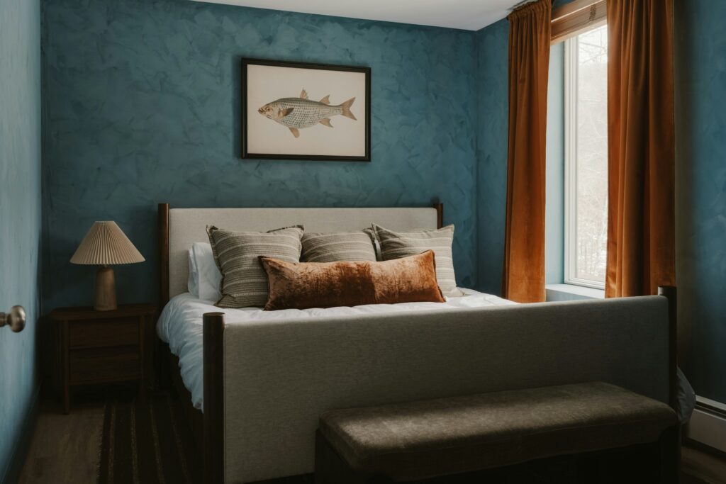
The mount is one of the most underrated elements of a correctly hung framed piece, and getting it wrong throws the whole thing off balance. Too narrow and the artwork feels cramped, as though it’s been squeezed into a space it doesn’t fit; too wide and the work shrinks into insignificance. As a general rule, the mount should be proportional to both the frame and the piece itself, with most works benefiting from a border of at least 5cm.
Colour is equally important here. A bright white mount can create harsh contrast against vintage prints or warmer-toned photography, so an off-white or cream option will often sit far more comfortably, softening the transition between image and frame. It’s a small detail, but one that makes a surprisingly large difference to how a piece reads on the wall.
Ignoring The Glass
Standard picture glass does the basics, but it comes with trade-offs that most people don’t consider until the damage is done. Glare is the most immediately obvious issue, making artwork hard to see depending on where it’s hung and how the light falls throughout the day.
The less visible problem is UV exposure: over time, direct or indirect sunlight will fade pigments, yellow paper, and degrade photographic prints, often so gradually that you don’t notice until the damage is irreversible. Museum-grade glass with UV filtering and anti-reflective coating costs more upfront, but for pieces hung opposite windows or in south-facing rooms it’s an investment that pays for itself in preservation alone.
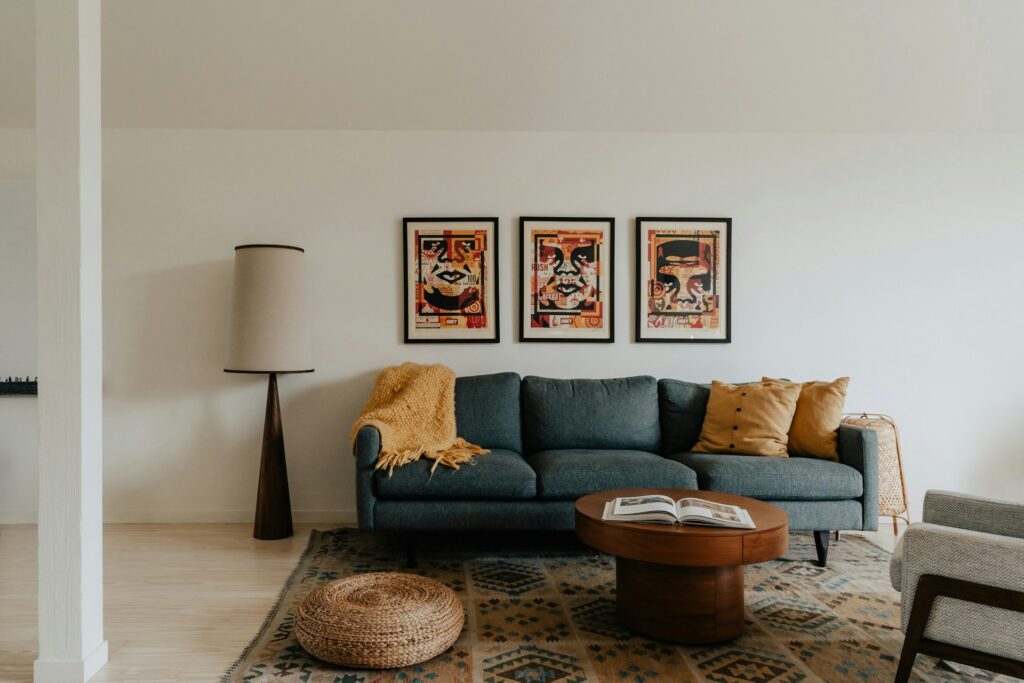
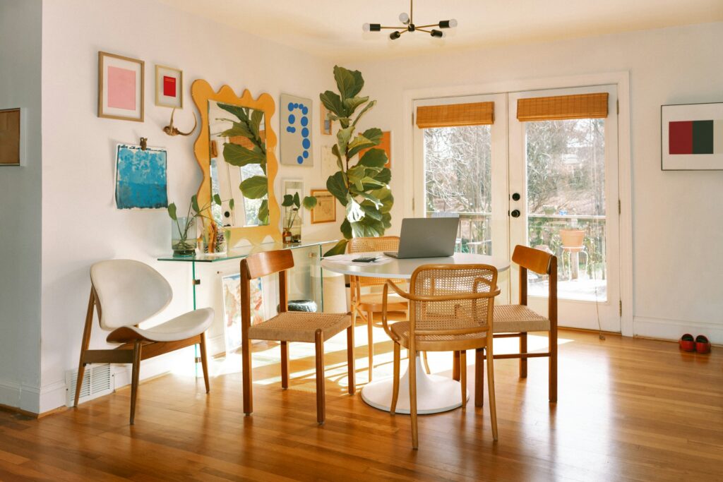
Matching Every Frame In The Room
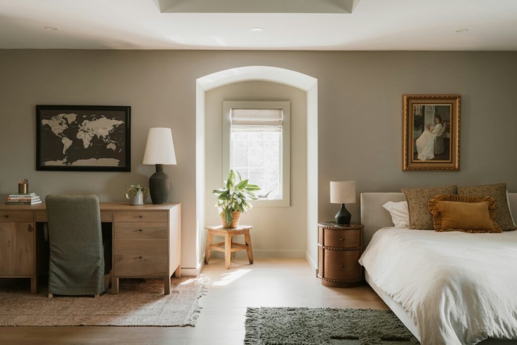
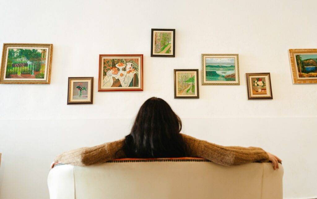
There’s a persistent idea that all frames in a room should match, and while the intention is understandable, the result is almost always a set of walls that feel flat and lifeless. Uniformity strips away the individuality of each piece, turning a collection into something closer to a hotel corridor.
A more considered approach is to find a loose thread that ties your frames together without making them identical, whether that’s a shared material like wood in varying tones, or a consistent width of frame across different finishes. The goal is cohesion rather than repetition, so that the eye moves between pieces with interest rather than glazing over.
Read: How to transform ‘sad beige’ into something soothing and sophisticated
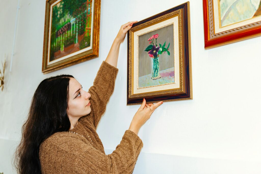
Using Ready-Made Frames For Everything
Off-the-shelf frames have their place, and for casual prints and posters they do the job perfectly well. The problems start when you try to force more demanding work into standard sizes, which usually means cropping the mount awkwardly to fit, leaving uneven borders, or worse, trimming the artwork itself to suit the frame. All of these compromises show, and they undermine work that deserves better.
For pieces you genuinely care about, bespoke framing is worth the outlay. As the specialistts at Lorimer Art Gallery and Bespoke Framing in Rugby tell us, tailored solutions can account for the specific dimensions, weight, and character of each piece, using conservation-grade materials where longevity matters. It’s the kind of detail that separates a wall that looks thrown together from one that looks genuinely considered.
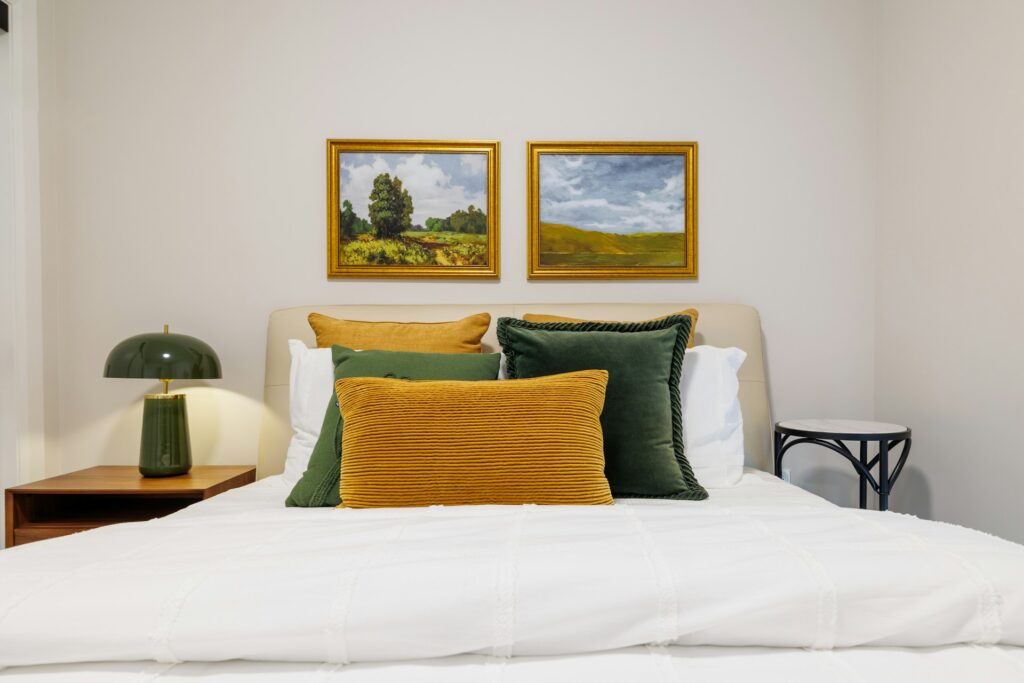
Hanging Art Too High
This isn’t strictly a framing mistake, but it’s so closely tied to how a framed piece lands in a room that it belongs here. The gallery standard is to position the centre of the artwork at roughly 145cm from the floor, which places it at average eye level, and yet most people hang significantly higher than this, particularly above furniture.
The result is a disconnect between the piece and the space beneath it: art that sits too high stops feeling like part of the room and starts feeling like it’s been pushed upward to fill a gap. Bringing it down to eye level is one of the simplest changes you can make, and it’s often the most transformative.
Neglecting The Back Of The Frame
What’s happening behind the glass matters more than most people think. Cheap backing boards can off-gas acids that gradually discolour mounts and damage the artwork itself, while a frame that isn’t properly sealed will allow dust and insects to work their way in over time. Neither of these problems is immediately visible, which is precisely why they’re so easy to ignore.
For anything with real value, whether financial or sentimental, acid-free backing boards and sealed dust covers are basic precautions that cost relatively little but make a significant difference over the years.
Overlooking The Relationship Between Art & Wall Colour
A frame that looked perfect in the shop can read completely differently once it’s up against your actual wall colour at home. Dark frames on dark walls tend to disappear, losing their definition, while light frames on white walls can wash out so completely that the piece feels like it’s floating without an edge. The mount colour plays into this dynamic too, acting as the intermediary between image and wall.
Before committing, it’s worth holding the framed piece against the wall in the room where it will actually hang, at different times of day if possible, because natural and artificial light will change the relationship between frame, mount, and wall considerably.
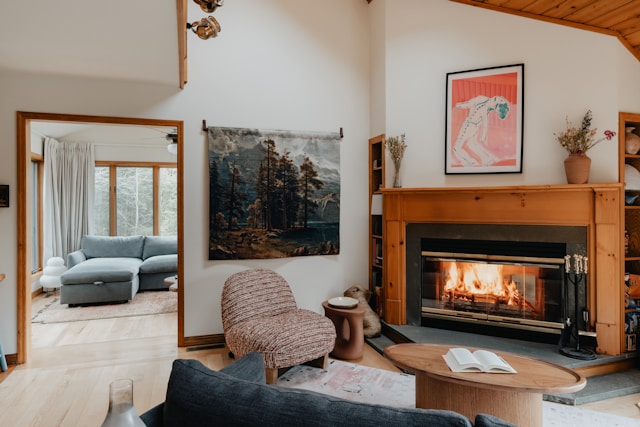
Going Too Ornate
Heavy, gilded frames have their place, particularly with classical portraiture and oil paintings of a certain vintage. But applying that same treatment to a modern photograph or a simple line drawing creates a mismatch that draws all the attention to the frame itself.
The framing should reflect the character of the art rather than impose a style onto it, and when in doubt, simpler tends to age better. A restrained frame also gives you more flexibility when a room eventually changes around it, which it will.
Treating Framing As A One-Off Decision
Art collections evolve, rooms get repainted, furniture changes, and light shifts with the seasons, so a frame that worked perfectly five years ago might not be serving the piece as well now. There’s nothing wrong with reframing work as your taste and your interiors develop.
In fact, it’s one of the more affordable ways to refresh a room without buying new art, and it gives you the chance to upgrade materials, swap out a mount that has started to yellow, or simply try a different look. Thinking of framing as a living part of your interior rather than a sealed-and-done job keeps your collection feeling current and intentional.
The Bottom Line
The art on your walls only works as hard as the framing around it. Getting the fundamentals right, from mount proportions and glass quality to the relationship between frame and wall colour, is what separates a collection that feels considered from one that looks like it was hung in a hurry. Most of these mistakes are easy enough to fix, and the ones that need professional help are rarely as expensive as people assume.


