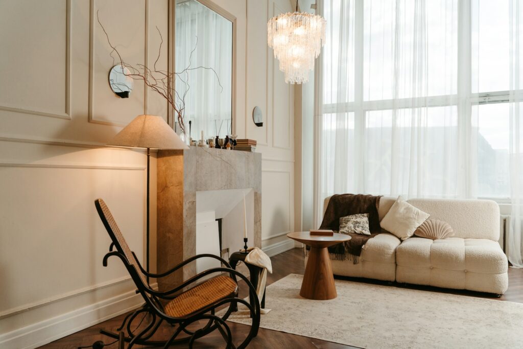
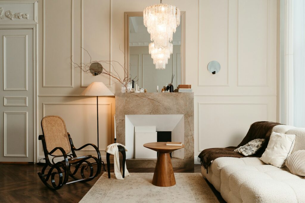
Ideal for creating a calming sanctuary that’s anything but boring…
Let’s address the elephant in the room: ‘sad beige’ has become something of a dirty word in interior design circles. Scroll through Instagram and you’ll find countless posts lambasting the neutral palette that’s dominated our homes for the past few years. But here’s the thing: we’re here to mount a proper defence of beige, because when done right, this much-maligned colour scheme can create some of the most sophisticated, calming spaces you’ll ever set foot in.
The secret isn’t avoiding beige. It’s transforming it from something that feels flat and lifeless into a backdrop that positively hums with warmth and character. Think less “magnolia walls in a rental flat” and more “Cotswolds country house meets Scandi chic”. Although, come to think of it, the former sounds just as nice. Anyway, let’s mount…
Start With Texture, Not Colour
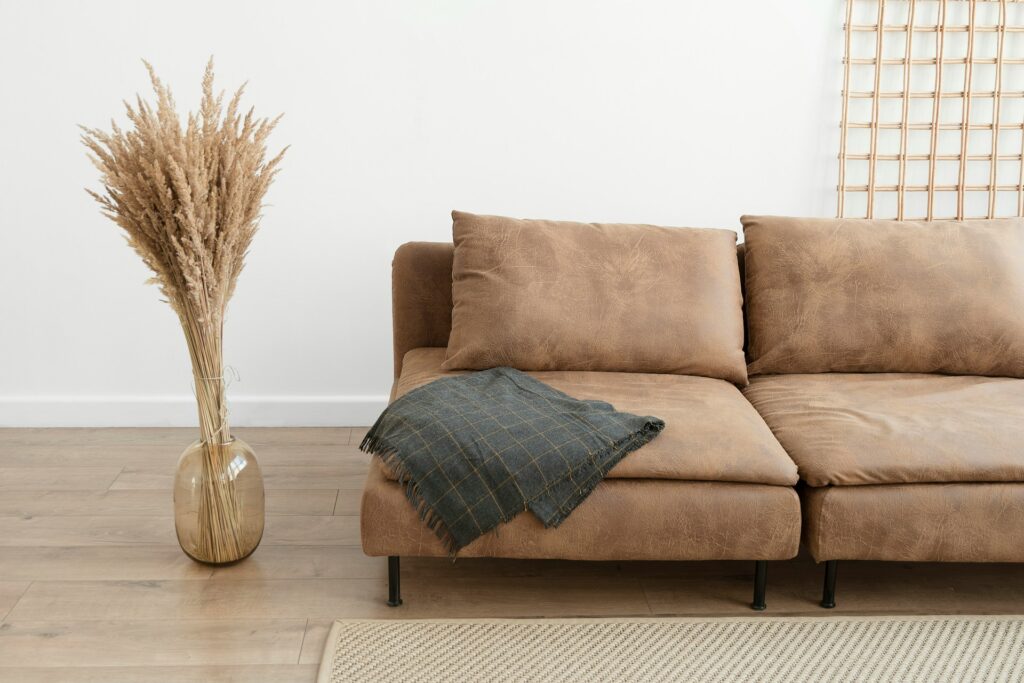
The biggest mistake people make with neutral schemes is thinking it’s all about paint colours. If you want to elevate your beige from sad to sophisticated, texture is your secret weapon. We’re talking chunky knit throws that beg to be touched, linen curtains that catch the light beautifully, and perhaps a jute rug underfoot that adds that essential tactile element every room needs.
Consider layering different materials with similar tones. A cream wool blanket over a taupe linen sofa, perhaps, or mixing smooth ceramics with rough-hewn wood. The eye might see one cohesive colour palette, but your hands (and subconscious) will pick up on all those delicious textural contrasts. It’s like the difference between a monotone photograph and one with proper depth and dimension.
Embrace The Power Of Pattern
Just because you’re working with neutrals doesn’t mean everything has to be plain. This is where many people go wrong with their beige schemes: they forget that pattern can work beautifully within a limited colour palette. Think subtle geometric prints in cream and taupe, or perhaps a classic stripe in varying shades of oatmeal.
Natural patterns work particularly well here. Consider wallpaper with a delicate botanical print in muted tones, or cushions featuring organic shapes that echo natural forms. The key is choosing patterns that whisper rather than shout. You want them to add interest without overwhelming the serene atmosphere you’re creating.
Lighting Is Everything
Here’s where most beige rooms fall flat: poor lighting. Harsh overhead lights will make even the most carefully curated neutral palette look clinical and cold. Instead, think layers of warm, ambient lighting that’ll make your space glow like a candle.
Table lamps with warm white bulbs, floor lamps that cast pools of cosy light, and perhaps some strategically placed LED strips for subtle accent lighting. If you’re feeling fancy, consider dimmer switches throughout. Nothing says sophisticated like being able to adjust your lighting to match your mood. And please, avoid those awful cool white bulbs that make everything look like a dentist’s surgery.
Read: How to show your kitchen in its best light, whatever the time of day or occasion
Add Life With Greenery
Every successful neutral scheme needs a touch of life, and plants are absolutely perfect for this. The organic shapes and natural green tones complement beige beautifully, whilst adding that essential element of vitality that prevents your space from feeling sterile.
Go for plants with interesting shapes and textures. A sculptural fiddle leaf fig in the corner, perhaps, or a collection of smaller plants with varying leaf shapes on your windowsill. Even if you’re hopeless with plants, a few well-chosen artificial ones can do the trick. Just invest in good quality ones, please. Nothing ruins a sophisticated space quite like an obviously fake plant.
Quality Over Quantity
This is where the beige aesthetic really comes into its own. When you’re working with a neutral palette, every piece in your room needs to earn its place. There’s nowhere for subpar furnishings to hide when you’re not relying on bold colours to create visual interest.
Invest in fewer, better pieces. Those gorgeous beige sectionals you’ve been eyeing up? They’ll work perfectly in a neutral scheme and become the anchor piece your room needs. Similarly, choose accessories with intention: a gorgeous ceramic vase, a well-made wooden coffee table, or a piece of art that speaks to you. Quality materials like natural stone, real wood, and proper textiles will elevate your space immeasurably.
Create Depth With Layering
The most sophisticated neutral spaces have depth, and that comes from thoughtful layering. Start with your largest pieces (furniture in mid-tones) then layer lighter and darker elements around them. Perhaps a cream rug under a taupe sofa, with darker cushions and a light throw for contrast.
Don’t forget about layering at different heights, too. A tall floor lamp next to a low coffee table, with perhaps a medium-height side table to bridge the gap. This kind of thoughtful composition creates visual interest whilst maintaining the calm, cohesive feel that makes neutral schemes so appealing.
Introduce Warmth Through Wood Tones
If your beige scheme is feeling a bit cool, warm wood tones are your friend. Think honey-coloured oak, rich walnut, or even painted wood in a warm cream. These natural elements add instant cosiness whilst complementing your neutral palette perfectly.
Consider a wooden coffee table, floating shelves, or even just a few wooden accessories like bowls or picture frames. The key is choosing woods with warm undertones rather than cool greys. You want to enhance that cosy, sophisticated atmosphere, not undermine it.
Don’t Fear The Whites
Many people stick rigidly to beiges and browns, but incorporating different shades of white can actually make your neutral scheme more sophisticated, not less. Crisp white trim, perhaps, or white ceramics against your beige backdrop. It’s all about creating subtle contrast that adds interest without breaking your colour story.
Think of white as the punctuation in your neutral sentence: used sparingly but effectively to create breathing space and highlight your beautiful beige elements. A white lamp base on a taupe side table, perhaps, or white bedding against beige walls.
The Devil’s In The Detail
Finally, remember that sophisticated design is all about the details. Switch out standard light switches for brushed brass ones. Choose curtain poles that complement your scheme rather than fighting against it. Ensure the curves in your home move fluidly rather than bump heads. Even something as simple as matching all your picture frames can make a significant difference to how polished your space feels.
Pay attention to the small things: the books on your coffee table, the way you style your shelves, even how you arrange your cushions. When everything works together harmoniously, that’s when your ‘sad beige’ truly transforms into something special.
The truth is, there’s nothing inherently sad about beige. Like any design choice, it’s all in the execution. Done thoughtfully, with attention to texture, quality, and those all-important details, a neutral palette can create some of the most sophisticated, restful spaces imaginable. So embrace the beige, and show those Instagram naysayers what they’re missing.


")