Would you believe it, but the official definition of the UK winter doesn’t begin in earnest until 21st December! Yep, even with those temperatures dipping towards zero and the country swathed in anticyclonic gloom, it’s still only mid Autumn guys. Brace yourselves…
Phew, what a year this has been, and there’s still six weeks of it left! Lord, have mercy. But rather than invoking the assistance of the big guy (or girl) upstairs, instead, we’re taking proactive steps today to bring some positivity and hope into our lives.
The last few years have seen a huge increase in homeowners turning their hand to DIY, either out of boredom or necessity, and the final third of this year looks set to be no different. Particularly, to celebrate the change of the seasons and hopefully represent something of a new beginning, professional and budding interior designers alike are turning to colour to provide that catalyst for change.
If you’re wondering where to start, and what’s hot and what’s not, then read on. We’ve spoken to a host of experienced interior design teams about the shades of the season, and here are their top colour tips for autumn and winter 2024.
Prediction Versus Reality
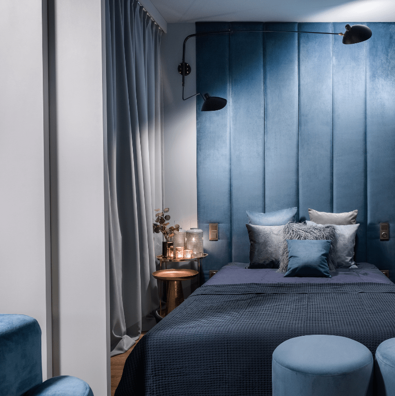
Back in those heady, half-optimistic days of 2019, the Pantone Colour of the Year for 2020 was declared as ‘classic blue’.
”Classic Blue was chosen because it highlights desire for a dependable and stable foundation on which to build as we cross the threshold into a new era,” they prophesied back in December of 2019.
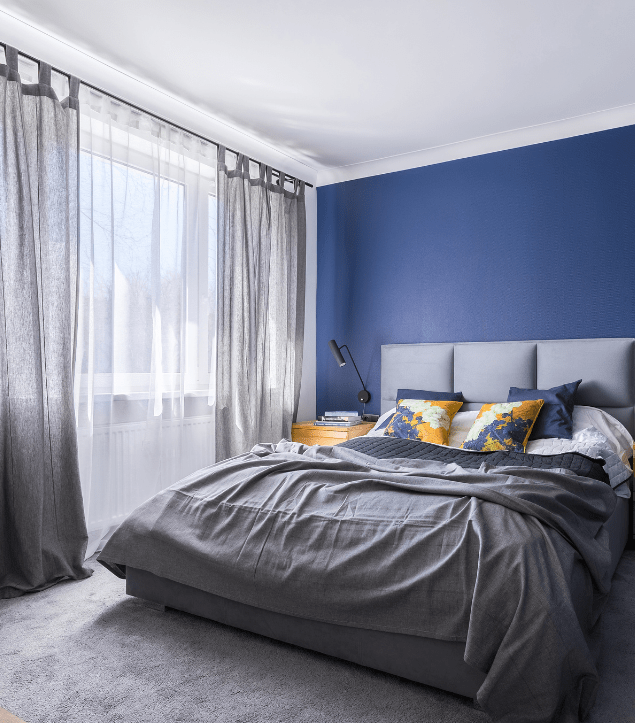
A dependable, stable foundation for a new era? Someone was having a laugh. But hindsight is a wonderful thing, and four years on, in these topsy turvy times – of national economic uncertainty and international, geopolitical turmoil – we need that sense of reassurance more than ever. Shades of classic blue then, particularly in the bedroom, might be a smart move, channelling interior design trends and soothing a tired soul, equally.
But should the irony of painting your bedroom walls such a strong and stable colour this year be just too jarring to bear, why not channel another big trend of 2024, and harness the power of ‘white on white’?
The interior designer Breeze Giannasio declared via Good Housekeeping that “while this might have been a sterile envelope before, it’s only getting more subtle and layered”. Hey, personally, we think that right now, evoking a sterile, clean atmosphere might be just the ticket. So, let’s talk about white…
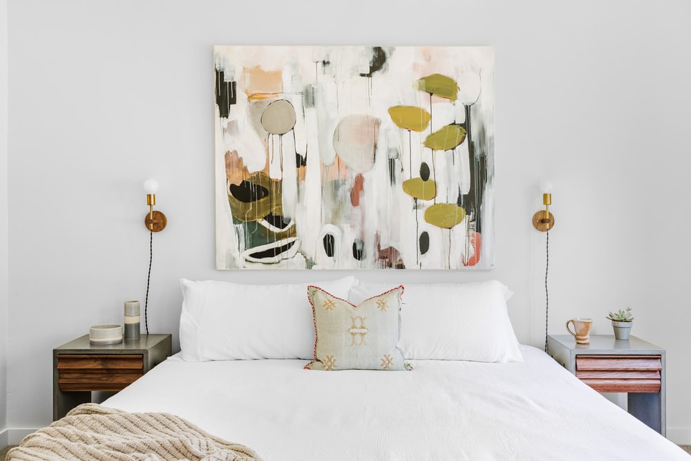
Save A Sanctuary
In autumn and winter, with folk spending more time at home, we expect the importance of a cherished bedroom space to rise further still. Interestingly, Schemes, who supply decorative paint in Dubai, tell us that recent home decor trends in the room ‘where the magic happens’ favour whites and greys in all their unassuming, self-effacing glory.
Combining these two colours, then, is the quickest route to a calming space. White is also implicative of fresh starts, and a blank canvas for the rest of the year and beyond.
Pairing fresh white linen (always a winner) with off white walls, a dusky grey carpet paired with earthy colour accents to remind us of the outdoors – via throws or cushions – makes a gloriously steadying triumvirate, don’t you think? And that’s something we all need right now.
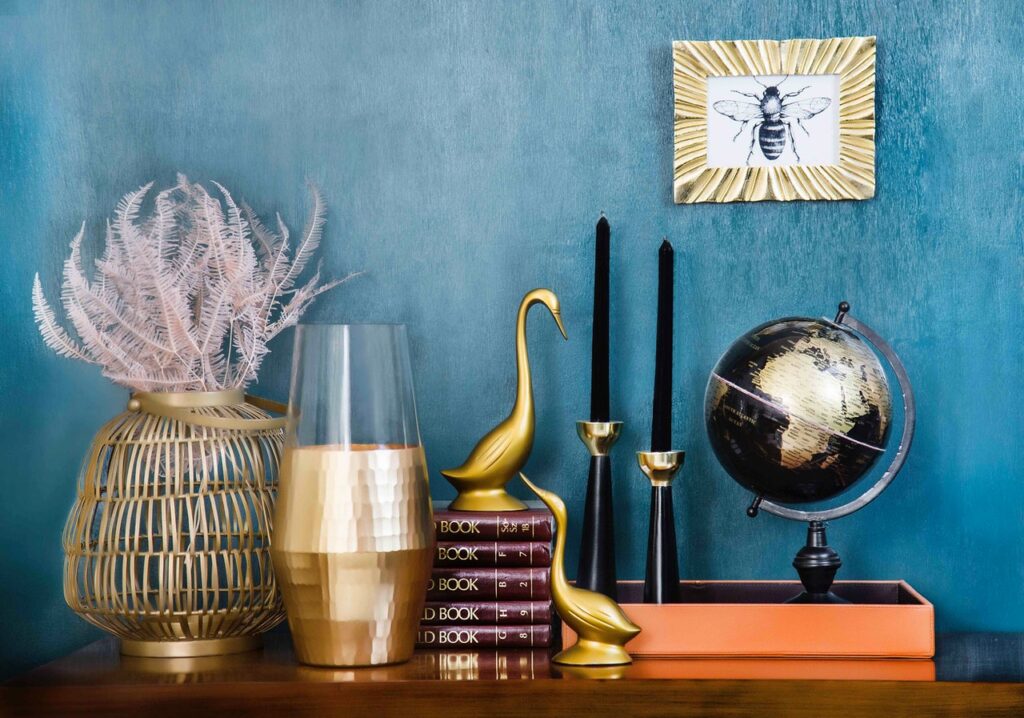
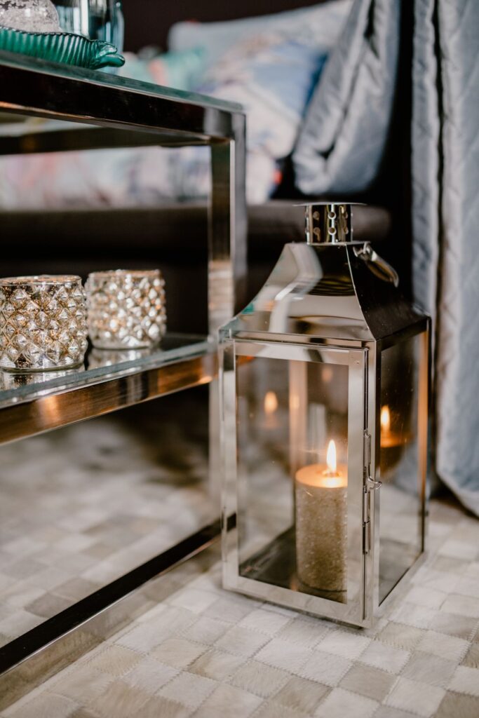
Dark & Dazzling Jewel Toned Interiors
This autumn-winter season, go bold by adding a rich and oh-so sophisticated palette to your home. Dark interiors have been on trend for several seasons now and when the temperature drops, there’s no better time to embrace this aesthetic.
Jewel-toned interiors are all about adding colours that are richly saturated in the same hues as gorgeous gemstones; think sapphire blue, ruby red, amethyst purple, citrine yellow, and emerald green, in particular. Just as you do with your clothes, the autumn-winter season is all about layering your interiors, so start with deep, dark wall colours then add jewel-toned accessories. Play with texture by adding soft furnishings like faux fur or velvet, which give a sheen to darker colours like sapphire and emerald green.
Bring your jewel tone to life with metallic touches which not only give a luxurious edge, but brighten up darker tones up. We’re thinking of brass lamps and candlesticks, gold trays and vases for that glamorous yet sophisticated phrasing.
Changing from a neutral to rich look can be daunting, so consider contrasting these intense colours against a neutral backdrop for best results, as some of the UK’s best current interior designers tend to advise.
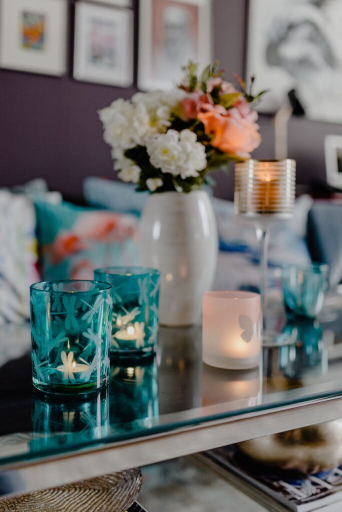
Bring Yourself Back Down To Earth
As the days get colder and the nights draw in, it might be a wise move to bring the outside in, and channel the natural, earthy, warm tones of autumn in your living room.
Auburns, oranges, rust, forest green and teal are just some of our favourites from the Fall colour palette, and in lieu of crunching fallen leaves underfoot, why not herald the arrival of a new season by changing up the colourscape domestically, in the living room?
This change in palette needn’t mean repainting the walls again (you only just rendered everything white on white, after all) but rather, a change up in the finer details. Consider an accent wall in an autumnal shade; rust on white sounds kinda classy, after all. Or, introduce a piece of statement furniture; perhaps a wingback power chair in teal, sitting in a corner, sounds just the ticket?
Don’t neglect texture either, which is a mainstay of autumnal interior design. To your sofa, adding additional throws, cushions, rugs and blankets in the shades of the season will add warmth both visually and physically. We love it.
Shades Of Productivity
With more of us working from home than ever, it’s time to introduce some more permanent features to help your #WFH be as efficient and productive as it can be.
We’re here to talk colour today, so firstly, a little psychology on the subject. In general, it’s been posited by experts that colour does indeed affect behaviour, sometimes in surprising ways, with blue shades affecting your mind; yellow your emotions; red your body; and green your ‘balance’. So, rather than simply painting your home office the most productive colour (which, according to Google, is blue) you should fine-tune your decisions to match both your job’s responsibilities and your working style.
For creative work, strong shades of yellow can stimulate imagination, while more muted tones will engage a more emotional side to your work; choose wisely here for the ideal output on the page. Red encourages a certain kind of physicality (the starker, the more aggressive, generally) so if you’re working from home doing something which involves the body, such as personal training via Zoom, then definitely harness the power of rouge.
Green shades, including those autumnal hues we encouraged earlier, are calming; superb for problem solving and lateral thinking. And blue is said to invigorate mind work. Though it’s said they ‘should never be seen’ together, green and blue in your home office will likely encourage focused, balanced thinking throughout the day.
Why not harness the power of each colour in a task dependant way, with interior design flourishes which are transient and flexible; think houseplants in different shades which you can move into view as the day’s role demands it. Or, a cacophony of colour via artwork and sculpture, if you can handle the productivity overload!
Next up, don’t overlook the power of aroma around the home, either.


