Hey, we don’t wish to be presumptuous here, but since you’ve alighted at this article, we’re going to be. Perhaps you’re here because your home desperately needs some repairs and renovations? Maybe some fresh front-lawn flowers, windows, or a new roof to enhance its function and appeal could do the trick? Or, will a fresh lick of paint be all that’s required?
Although these changes may be beneficial for the home, enabling you to increase its value, it’s important to look at the flip side, too; not implementing safe and visually satisfying exterior design could inadvertently reduce your home’s value. To ensure that this doesn’t happen, you need to know what to avoid. So, what common exterior design mistakes are undermining your renovation efforts? Here are 5 major exterior design mistakes and how to avoid them.
CHOOSING YOUR PAINT COLOURS FIRST
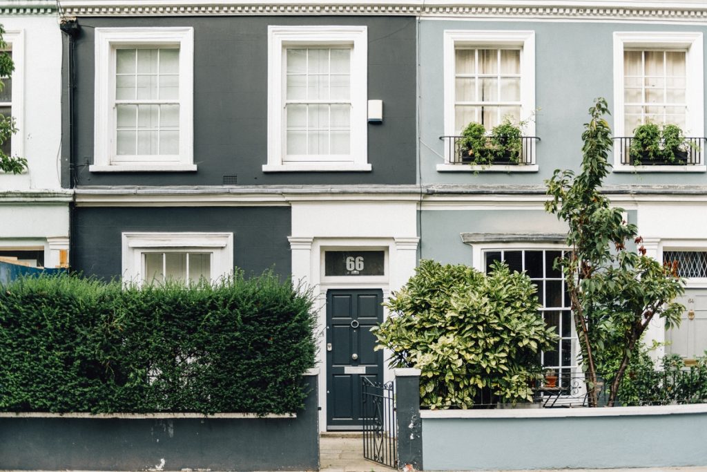
Colour plays a significant role in improving the exterior layout of your home; however, it isn’t the first thing you should prioritise, even if you’re in the famously vibrant Notting Hill, Bristol’s Clifton or the gorgeous Portmeirion in Wales.
Instead, you may want to consider some factors such as the theme of your home, its architectural style, and its location, prior to arriving at the potential colour of the facade.
Before picking a colour, be sure to reconsider the other elements, if possible, leaving painting until the final stages of any renovation process to ensure you make the right choice and everything looks synergetic.

A BOLD, EXAGERRATED OUTDOOR SPACE
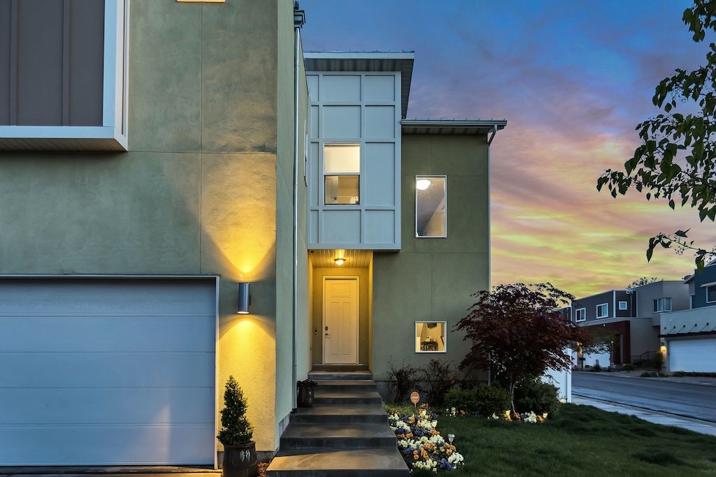
Understandably, you’ll want your outdoor space to look stylish. However, this desire can lead many homeowners to incur expensive costs as they go overboard to achieve a bold and exaggerated outdoor space, which offers little ROI as such a singular style can be unappealing to potential house buyers.
Instead, a more subtle design is more likely to attract positive attention and enhance that all important kerb appeal.

GETTING STUCK IN THE PAST
Manchester based property development gurus Salboy tell us that ‘’older buildings that have been refurbished and renovated to be more modern and appealing’’ tend to be attractive to property investors, as you can enjoy the character of a period property and the functionality of a more modern home simultaneously.
A common mistake homeowners make is to get stuck in the past, refusing to renovate the exterior of their property because they are keen to retain its character and charm. Sadly, this can lead to structural issues going unattended and worsening.
INCONSISTENT HEADER HEIGHTS
It may not seem like much, but having varying heights can affect the appeal of your home and its value. Many homeowners underestimate how vital it is to ensure the header of your doors, windows, and transom heights complement each other to create a unified appearance. Inconsistent header heights make your home look skewed and unpresentable.
APPLYING STONE VENEER IN WRONG PLACES
A standard exterior design mistake that homeowners tend to make is placing stone veneers in the wrong places. Make sure that the stone has a corner to allow for a more natural look. Without a corner, the stones look too superficial and unappealing. To be safe, it would be helpful to find stone pieces with three corners to run perfectly along other planes and sides of the building. To make your stone veneer even more appealing, be sure you stick to one pattern and type of stone instead of integrating multiple materials and styles, the latter of which can look mismatched.
Now that you know the mistakes you should avoid, what have you got to lose? There are so many creative ways to renovate your home’s exterior to increase its appeal and value. Good luck!


