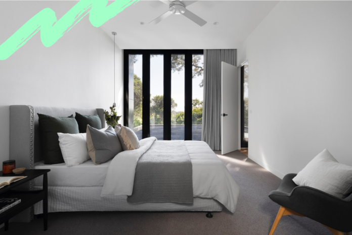
Elegance; it’s all in the beholder’s eyes, right? But when it’s your own touches of artistic flair and interior design, domestically, then that view belongs to you. And sometimes, let’s face it, when you cast your eyes around your house, there’s a sense that perhaps things need a little update. To truly bring that sense of sophistication and style, read on; our 4 IDEAL steps to a more elegant home design.
LIGHT & SHADE
This sounds almost too simplistic to be true, but it’s solid advice nonetheless and shouldn’t be dismissed. Light is, generally speaking, the defining feature of any indoor space, even if we take its presence for granted.
A light fixture in the middle of your room automatically creates an impact one way or the other. A gaudy, cheap light fixture automatically brings down the feel of a room, while an elegant light fixture creates a more tasteful, luxurious atmosphere, both in the way it casts light and creates shade, and in the style of the actual piece itself.
The best part about changing light fixtures is that it’s not only one of the simplest DIY projects that you can take on, it’s also one of the most affordable. It’s all in the positioning and layering here, combining different lights to create a particular mood or feel. From side lamps illuminating a dark corner to flickering candles creating a warm glow, this layered approach is ideal for switching up the shade according to the activity you want to shine some light on.
COLOUR PALETTE
Another move you can make to increase your home’s overall sense of elegance is to add a lick of paint where change is needed most. ‘Elegant’ walls are often more neutral in their colour, but that doesn’t mean that a pop of colour elsewhere in the room won’t bring a certain amount of class to the space.
We don’t think we’re going out on a limb here when we say that few elegant spaces call hot pink, lime green, or electric blue their primary colour, but something calming as the predominant hue of the space is inherently classy. We love ecru, lavender, sapphire or even burgundy.
To really set the space off, consider buying an area rug, a piece of artwork, or a small table (you can paint an existing one) that has a splash of a brightness that complements, not clashes with, the wall colour.
HONE IN ON THE HEART OF THE HOME
There’s so point channelling all of this elegant energy if you’re not planning to entertain guests and luxuriate in your newfound sense of sophistication. And if you’re having people round, then the most important room to update decor-wise is, of course, the kitchen, the heart of any self-respecting home.
While modern appliances and other fixtures can drastically improve the look of your kitchen, such additions can end up being pretty costly. A more affordable way to get the space noticed is with an update of countertops, which can be chosen at trusted purveyors such as Marble (the clue’s in the name). While granite is certainly a classic look, marble usually represents a more budget friendly option. Running on average about £45 per square foot, marble countertops that come in a variety of colours and ingrained patterns can give your kitchen a sleek, elegant look for less money than granite.
CROWN MOULDING
Increasing your home’s elegance is all about the details, even the small ones. The presence of crown moulding gives any space a sense of completion. If you don’t have crown moulding right now, take a good look at where your ceilings meet your walls, and notice that it feels as if a blank space exists there. Crown moulding will fix this. Found in essentially any width, it’s generally advised that you go for the widest crown moulding that your budget will allow. The best part of crown molding is that it’s relatively cheap (especially for the plastic-based, easy to paint type) but looks expensive and brings an element of class and cohesion to any space.


