In the ever-evolving world of interior design, there’s one annual announcement that consistently sends ripples through the creative community (and inspiration for a million articles such as this): Pantone’s Colour of the Year.
And just in the nick of time, the colour authority has unveiled PANTONE 17-1230 Mocha Mousse as 2025’s defining shade – a sophisticated, warming brown hue that arrives at a pivotal moment when our relationship with home spaces continues to transform. Unlike the sometimes divisive selections of years past, this rich, earthy tone has garnered near-universal acclaim for its remarkable versatility and emotional resonance (and, in our case, for making us crave coffee ice cream).
This isn’t just another brown. As Leatrice Eiseman, Executive Director of the Pantone Color Institute, explains, Mocha Mousse “extends our perceptions of browns from being humble and grounded to embrace aspirational and luxe.” It’s a colour that simultaneously speaks to our collective desire for comfort while answering the call for understated luxury—a challenging balance that few hues manage to strike.
But let’s be honest—incorporating a new colour into your home can quickly veer into predictable territory. Another feature wall? Yawn. Some new cushions? Far from original. Instead, we’ve gathered some more gently inventive approaches to weaving this evocative, delicious hue into your living spaces, ensuring your home doesn’t look like a carbon copy of the next Mocha Mousse enthusiast’s abode.
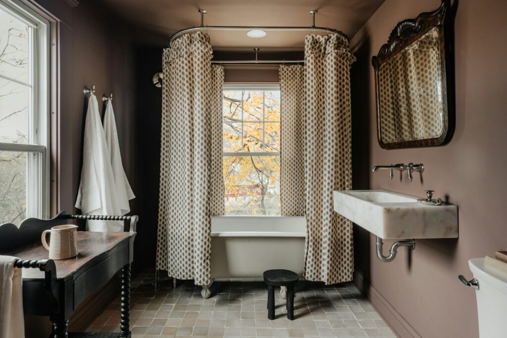
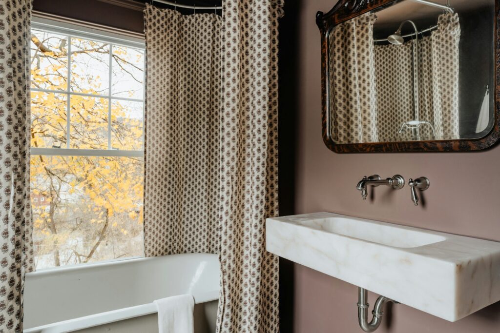
The Bathroom: Spa-Like Sophistication
The bathroom presents unique opportunities for Mocha Mousse, particularly as this often clinical space evolves into a personal wellness retreat. The colour’s inherent warmth counteracts the cool, hard surfaces typically found in bathrooms while its association with earth and natural elements enhances the sensory bathing experience.
Bath Panel Revolution: Replace standard bath panels with painted beadboard in Mocha Mousse to add unexpected architectural detail and warmth to typically cold spaces. For a truly cohesive look, colour-match accents like soap dispensers or toothbrush holders.
Vertical Accent Strips: Rather than tiling entire walls, create vertical accent strips of Mocha Mousse tiles interspersed with lighter neutrals. This technique draws the eye upward, making ceilings appear higher while adding rhythm to the space. It’s particularly effective in shower enclosures where it creates a waterfall-like visual effect.
Inverted Feature Zones: Invert the typical feature wall approach by using Mocha Mousse on all walls except behind key fixtures like vanities or baths. This creates a framing effect that highlights these areas while maintaining the warmth of the colour throughout the rest of the space.
Grout as Accent: For those already committed to neutral tiles, consider the revolutionary approach of Mocha Mousse grout lines. This unexpected application creates a subtle grid pattern that adds definition and warmth without overwhelming the space. This technique is particularly effective with large-format white tiles where the grout lines become an intentional design feature rather than a necessary evil.
Ceiling Treatment: In bathrooms with adequate ventilation, a Mocha Mousse ceiling creates a particularly cocooning effect during bathing. When paired with strategically placed uplighting, the ceiling seems to recede and expand simultaneously, creating a meditative atmosphere ideal for relaxation.
The Living Room: Unexpected Applications For Everyday Spaces
The living room has long suffered from design conservatism—neutrals on neutrals with perhaps a ‘pop of colour’ if one is feeling particularly adventurous. Mocha Mousse offers an opportunity to break this cycle without veering into visual chaos.
The Fifth Wall Celebration: While everyone obsesses over their four walls, ceiling personalisation remains criminally overlooked. A Mocha Mousse ceiling creates an intimate, cocooning effect that draws the eye upward and makes even modest ceiling heights feel intentional rather than limiting. Pair with lighter walls for a sophisticated inversion of traditional design rules.
Frame The View: Rather than painting entire walls, paint just your window and door frames in Mocha Mousse, creating architectural definition that draws the eye to transitions and openings. This technique transforms mundane functional elements into deliberate design statements while using minimal paint.
Textile Layering Revolution: Abandon the predictable cushion approach and instead experiment with broader sofa styling by unexpectedly layered textiles in varying shades of brown. A Mocha Mousse wool throw draped over a slightly lighter linen sofa cover, accented with both darker and lighter cushions, creates a tonal landscape that adds sophisticated depth.
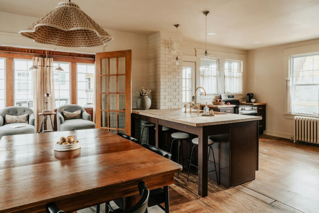
The Kitchen: A Sensorial Revolution
The kitchen offers a playground for experimentation with Mocha Mousse, particularly as this space increasingly doubles as a hub for both nourishment and socialisation. The colour’s association with comforting food experiences—chocolate, coffee, baked goods—makes it surprisingly appetising in culinary contexts, contradicting the old design adage that browns should be avoided in food preparation areas.
Rhythmic Cabinetry: Forget the all-or-nothing approach to cabinet painting. Instead, create a rhythmic pattern by alternating Mocha Mousse cabinets with complementary tones. Think of your cabinets as a musical composition—you need rests between notes. Alternating every third cabinet in Mocha Mousse, particularly in larger kitchens, creates visual interest without overwhelming the space.
The Unexpected Island: Rather than applying the colour to vertical surfaces, save it exclusively for your kitchen island, particularly the sides rather than the worktop. This draws attention to the gathering place while keeping workspaces bright and functional. For added dimension, consider a graduated effect where the colour deepens toward the floor.
Culinary Colour-Blocking: In open shelving, paint only the backs of cabinets in Mocha Mousse while keeping shelves themselves in contrasting tones. This creates depth and allows your culinary tools and dishware to stand out dramatically. This approach is particularly effective with white ceramics or glassware collections.
Illuminated Accents: Under-cabinet lighting takes on new sophistication when it washes over Mocha Mousse surfaces. The warm light interaction emphasises the colour’s rich undertones and creates a particularly inviting ambiance for evening gatherings.
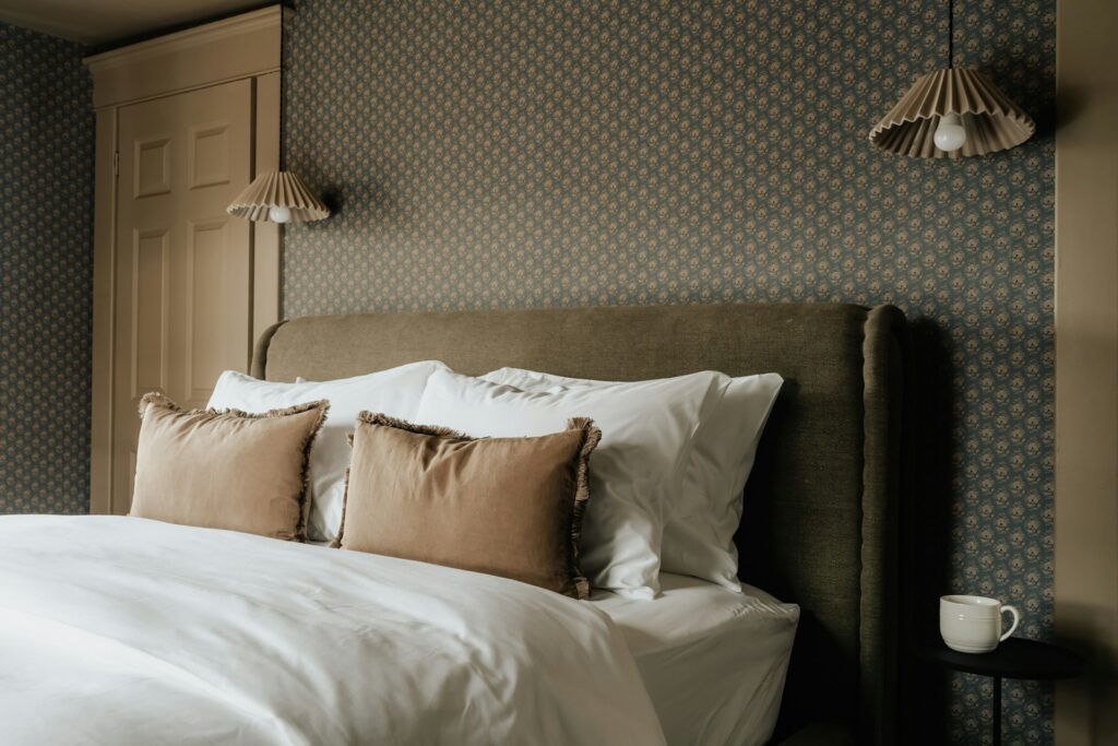
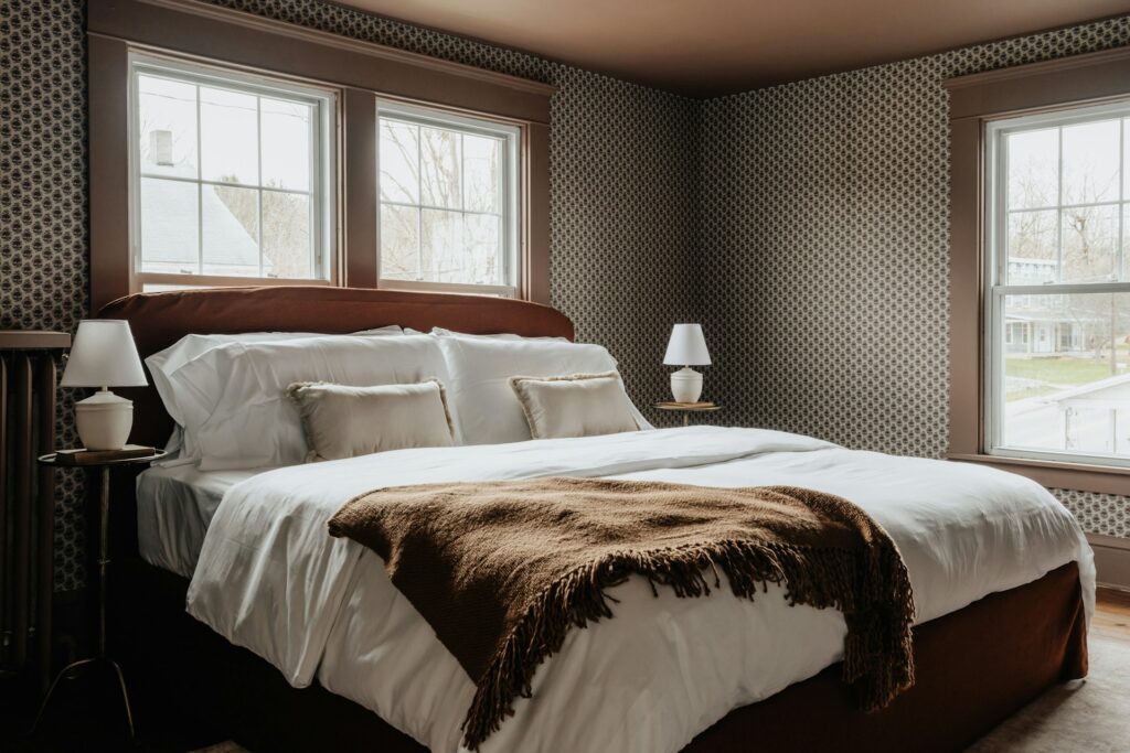
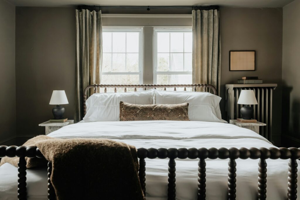
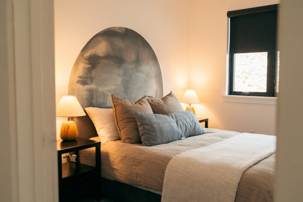
The Bedroom: Psychological Comfort Zones
In the bedroom, Mocha Mousse offers more than aesthetic appeal—it provides psychological benefits as well. Earthy tones can lower stress levels, making them ideal for sleep spaces. Unlike stark neutrals that can feel clinical or dark colours that can feel heavy, this particular brown hits the sweet spot of being simultaneously grounding and gentle.
The Envelope Technique: Rather than the predictable feature wall behind the bed, consider enveloping just the sleeping nook in Mocha Mousse. Paint the wall behind the bed and extend it one metre along each adjoining wall, creating a embracing zone that subtly designates the sleeping area without hard boundaries. This technique is especially effective in studio apartments or larger bedrooms.
Painted Fabric Headboards: For the adventurous, fabric paint specifically formulated for upholstery can transform an existing light-coloured headboard into a Mocha Mousse statement piece. The slight stiffening of the fabric creates an interesting textural element that standard upholstery lacks.
Shadow-Line Detailing: Create an architectural feature by painting a horizontal band of Mocha Mousse around the room approximately two-thirds up the wall. This technique, borrowed from heritage properties, adds architectural interest to plain rooms while creating a visual lowering of the ceiling that enhances intimacy.
Gradient Bedding: Rather than solid-coloured bedding, experiment with ombré or gradient textiles that transition from Mocha Mousse to lighter complementary tones. This creates movement and interest without the fussiness of patterns.
Complementary Colour Alchemy
One of Mocha Mousse’s greatest strengths is its remarkable compatibility with other colours, creating combinations can be applied in interesting ways:
Sage Green: The combination of Mocha Mousse with sage green creates a sophisticated nature-inspired palette that works brilliantly in unexpected applications like inside cupboards or on furniture undersides.
Dusty Blue: Mocha Mousse finds a perfect partner in dusty blue tones. Try this combination in 70/30 proportions (70% Mocha Mousse, 30% dusty blue) for a sophisticated take on the earth-and-sky motif that feels both grounding and uplifting.
Terracotta: When combined with terracotta, Mocha Mousse participates in a warm, unified palette that evokes Mediterranean sophistication. Rather than using these colours in equal measure, try a 60/30/10 approach, with 60% neutral base (like cream), 30% Mocha Mousse, and 10% terracotta as an accent.
Unexpected Black Accents: For a surprisingly contemporary edge, pair Mocha Mousse with matte black accents in strategic, unexpected places like window hardware, light switches, or the legs of furniture. This combination elevates the colour from comfortable to decidedly sophisticated.
Texture As A Colour Amplifier
The sensorial quality of Mocha Mousse isn’t limited to its visual impact—texture plays a crucial role in maximising its effect. By varying texture while maintaining colour consistency, you can create spaces with tremendous depth without relying on stark colour contrasts.
Textural Juxtapositions: Combine dramatically different textures in the same Mocha Mousse tone—think glossy wall paint against matte floor tiles, or smooth leather furniture against nubby bouclé cushions. This creates a sophisticated monochromatic look with tremendous visual interest. For those seeking to incorporate living elements, consider how the rich brown backdrop makes green wall art and plants stand out with particular vibrancy, creating natural focal points throughout your space.
Plaster Experimentation: Textured plaster techniques like tadelakt or Japanese clay finishes in Mocha Mousse create walls with tremendous depth that change appearance throughout the day as light shifts. Unlike flat paint, these finishes invite touch and create a multisensory experience.
Split-Finish Furniture: Commission or DIY furniture that combines Mocha Mousse in different finishes—perhaps a sideboard with matte doors and glossy top, or dining chairs with velvet seats and lacquered frames, all in carefully matched Mocha Mousse tones.
Thread Count Contrasts: In bedding, combine different weights of Mocha Mousse textiles—perhaps heavyweight linen sheets with lightweight sateen pillowcases—to create subtle distinction within a unified colour scheme.
Seasonal Adaptation Without Replacement
Unlike colours with strong seasonal associations, Mocha Mousse transitions elegantly throughout the year with minimal adjustment needed. This adaptability makes it a particularly savvy investment for those looking to minimise seasonal decor overhauls.
Summer Lightening Techniques: In warmer months, Mocha Mousse spaces can be lifted with natural elements like dried grasses, bleached woods, and textural linens. These additions maintain the colour scheme while introducing elements that feel appropriately seasonal.
Winter Deepening Strategy: As temperatures drop, introduce deeper complementary tones like burgundy or forest green through easily changeable elements such as botanicals, book displays, and small textiles. These additions enhance Mocha Mousse’s inherent warmth without fighting against it.
Transitional Metallics: Between seasons, metallic accents can ease transitions—copper and gold for autumn, silver and chrome for spring. These reflective elements add dimension without requiring commitment to new colour schemes.
The Bottom Line
By approaching this colour with creativity and a willingness to break conventional design rules, you can ensure your interpretation of 2025’s defining hue remains distinctly, refreshingly yours.


