Creating a unique and memorable logo is an important part of establishing your business’s brand. Your logo will represent your company on all platforms, so getting it right from the start is crucial. Coming up with creative ideas that stand out in a crowded market can be challenging. To help inspire you, here are twelve unique logo design concepts to consider for your business.
Making Your Business’s Logo Truly Stand Out
Incorporate Optical Illusions
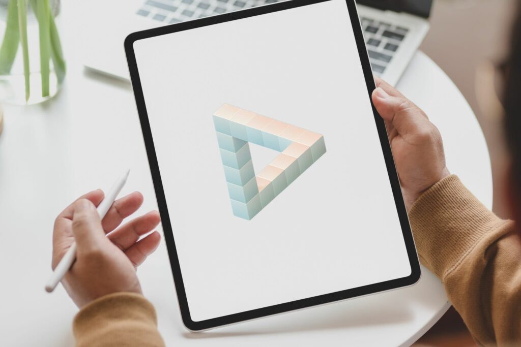
One approach to creating an eye-catching and unforgettable logo is incorporating elements of optical illusions. Our minds are naturally drawn to these types of visuals that seem to defy reality. There are many different ways you can harness illusion in your design. You could use negative space to imply two images in one logo, also known as a double entendre. Or you could play with perspective, making some elements appear closer or further away.
Other popular illusions are the Penrose triangle (impossible object) and Rubin’s vase (ambigram). Just make sure the overall image relates to your brand. Done right, these types of optical illusion designs capture attention and stick in people’s minds.

Use Unconventional Shapes
Most logos incorporate common geometric shapes like circles, squares, and triangles. For a more unique look, think outside the box by using atypical silhouettes, such as irregular organic shapes or complex polygons with multiple intersecting lines. Unusual fonts can complement the aesthetic. This type of logo conveys creativity and innovation.
Incorporate Hidden Symbols
Add a layer of depth by including subtle symbols that represent your brand. For example, a technology company could hide binary code or schematics in their logo design. Or an outdoor company could use topographical map lines creatively drawn into the image. Make sure the symbols relate logically to what your company provides. When done strategically, this adds an element of intrigue and personality to the logo, inviting the viewer to engage more deeply.
Use Your Name Creatively
Turn your company or product name into a pictorial mark, also known as a logotype. Look for ways to visualise the letters, such as using negative space to form the letters or connecting them to create an image. The FedEx logo, for instance, turns the letters “E” and “X” into an arrow, implying speedy delivery. This can result in a logo that ingeniously incorporates your brand name while also communicating something about its identity or mission. It makes the logo more unique and memorable.

Go Retro
Vintage themes are perpetually popular across generations. Tap into timeless retro styles like art deco, 70s psychedelia or 1950s kitsch for a nostalgic yet fresh take. You can imbue these throwback visuals with modern sensibilities for a versatile logo with cross-demographic appeal. Retro logos also stand out by looking less trendy and temporary.
Read: How to live a more vintage lifestyle in 2024
Use Local Inspiration
Reflect your geographic location in the logo design. For example, a brand based in San Francisco could subtly incorporate the Golden Gate Bridge. A brand from London might use Big Ben or the Houses of Westminster. This gives your business an authentic regional vibe that consumers will identify with. Local inspiration can apply to any city, landmark, symbol or element strongly associated with the area in which your business operates. Just make sure it’s recognisable and appropriate to your brand identity.
Hand Drawn Elements
Incorporate a hand-drawn aesthetic for a warm, approachable vibe. Elements like brush stroke typography, pencil sketching, or watercolour washes give the impression that your logo was carefully crafted by hand. While still clean and readable, imperfections add organic character. This style exudes creativity and originality. Just ensure the final logo is polished and doesn’t look too DIY. Pairing hand-drawn elements with geometric shapes or clean lines balances the look.
Use Your Mascot
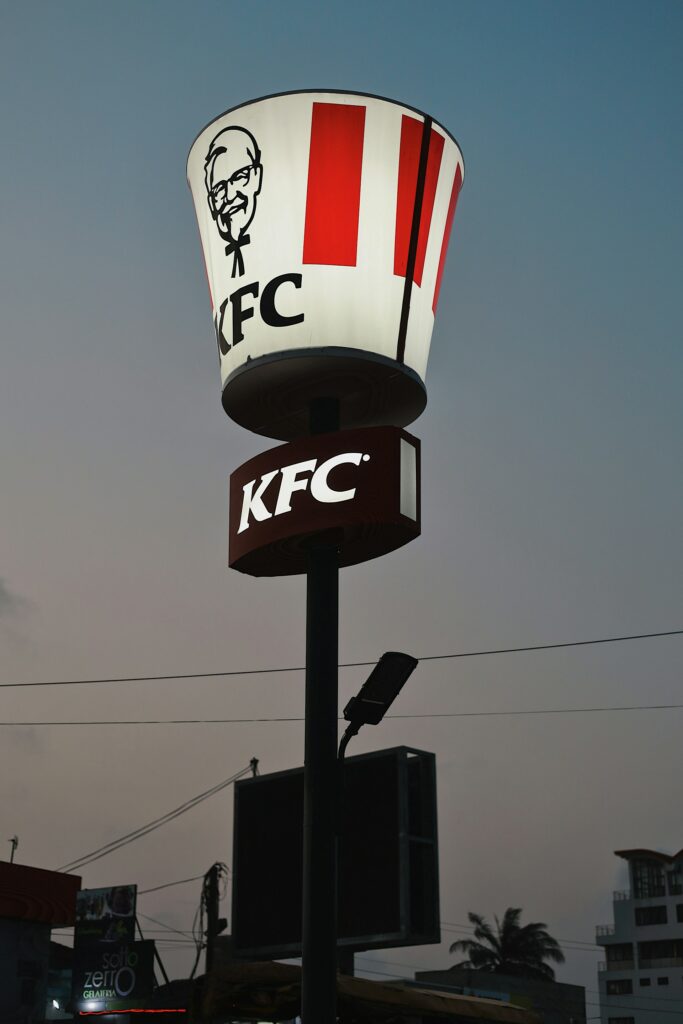
If your brand has a mascot or character, leverage it in your logo. We all know that the iconic founder of KFC, Colonel Sanders, is part of its logo, adding personality and familiarity. Doing so provides built-in equity and are inherently distinctive. Just ensure the mascot visually communicates your brand identity. It should be adapted to fit the logo design aesthetic rather than look out of place. But done right, a branded character makes your logo memorable and endearing.


Embrace Minimalism
In an overly busy world, a minimalist logo can stand out by providing visual calm and clarity. Streamlined logos using clean, negative space to frame a few decorative elements that look uncluttered and refined. This style also portrays sleekness and efficiency. Keep in mind simplicity, but still be original. Play with scale, positioning and negative space to create a distinct minimalist logo.
Embrace The Abstract
Totally abstract logos with no recognisable objects can captivate through pure imagination. These designs surprise viewers by allowing endless interpretations. Abstracts also suit a wide range of businesses because they don’t box the brand into any one industry. Keep abstract logos visually pleasing and aligned with your brand vision. Allow some impressions to come through creatively, even if it’s different for each viewer. Abstraction done innovatively gives your logo a contemporary edge.
Mimic Natural Texture
Incorporate natural-looking textures like wood grain, marble, terrain or water. This grounds the logo in the real world with familiar visuals. Textures also add tactile, soothing impressions. Using them creatively implies your brand is genuine, grounded and connected to real materials. Aim for natural textures that symbolise your specific niche. A furniture brand, for instance, could mimic wood textures. Just ensure the patterns don’t make your logo overly busy. Clean, minimalist integration keeps it feeling polished.
Crowdsource Ideas
Tap into the collective creativity of your customers and community by crowdsourcing logo ideas. Set parameters for your desired style and theme, then have people submit designs. This engages your audience while yielding diverse options to choose or draw inspiration from. You may be surprised at the creative directions regular people take. Bringing customers into the process also builds brand affinity. Just provide guidelines and have a structured review process to ultimately choose the winner internally.
The Bottom Line
The possibilities are endless when designing unique logos. Don’t be afraid to colour outside the lines and get imaginative. Aim for ideas aligned with your brand identity that also feel new and distinctive in your industry. With so many competitors, a memorable and original logo can be your secret weapon to stand out and connect with consumers.


