Pantone have just declared ultra violet as its colour of the year, 2018. Loved by some, hated by others, this vibrant shade is not for the faint-hearted or sensitive eyed, but with the right application, it can bring real personality to a room. We’ve teamed up with Hillarys and self-confessed colour lover, TV presenter Sophie Robinson, to discuss how to inject a touch of cosmic colour into our houses. So, here are 4 IDEAL ways to add a pop of ultra violet to your home.
EMBRACE THE NEW
Ultra violet has already sent shockwaves through the interior design fraternity. It’s a real marmite colour, people either love it or hate it, but, says Sophie Robinson ”I’m a purple lover, I love its intensity and vibrancy, it’s a really uplifting, feelgood colour and I can’t wait to see it popping up in the best-dressed interiors”. So leave behind all thoughts of Cadbury’s Cream Eggs, Barney the Dinosaur and Lawrence Llewellyn-Bowen in all his purple velvet suited glory and embrace the new power of purple.
EXPERIMENT WITH DIFFERENT COLOUR COMBINATIONS
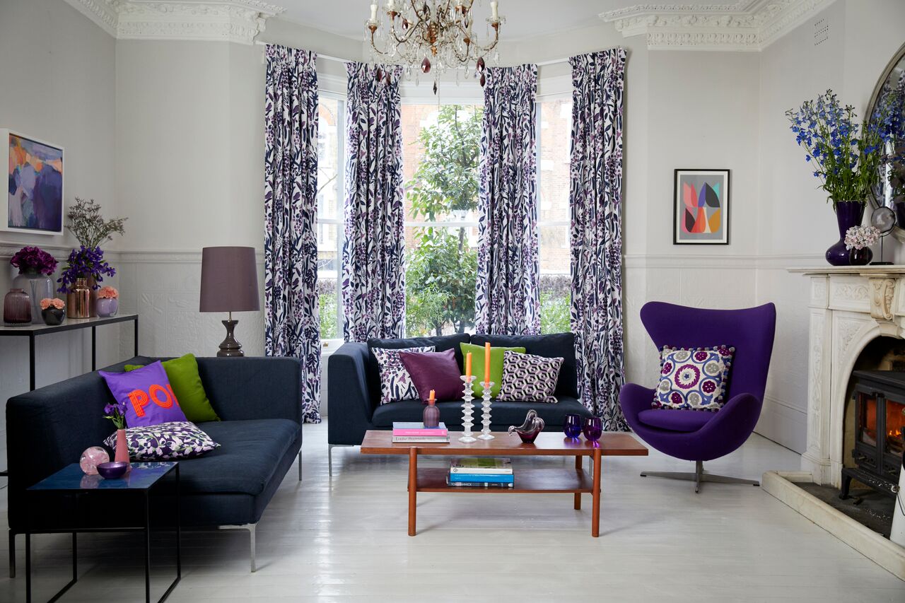
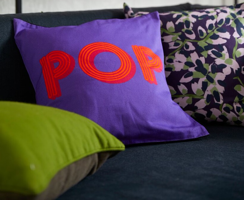
From a design perspective, ultra violet offers a whole spectrum of opportunities, from highly original interiors full of texture and contrast to blended shades that subtly express one’s own design personality. The great thing about ultra violet is that it can hold its own with a diverse range of colours. It can act as a dark foil for acid brights, a cool partner for hot hues and a safe anchor for delicate pastels. Play with all of these colour combinations, incorporating blousy floral displays in complementary shades of lilac, coral, rose and indigo, and throwing in fresh pops of neon pink and acid green with a mix of contemporary and retro cushions. To put it simply, don’t be afraid to experiment.

KEEP YOUR WALLS NEUTRAL
“Don’t be tempted to simply paint a feature wall in Ultra Violet and leave it at that,” continues Sophie. “Instead, keep your walls neutral and let the soft furnishings do the design work for you”. Wise words, indeed.
AVOID GOING MATCHY MATCH
Avoid going all matchy matchy and instead mix florals with geometrics to give a more interesting look. Always do something unexpected – especially in the finer details – like a pop of neon in a cushion and the same in a candle.


