Ideal for budding designers and entrepreneurs looking to begin or diversify.
Starting out as an entrepreneur represents a great leap of faith in any industry. Pouring your effort and resources into a business and hoping it is well-received can be anxiety-inducing. Sink or swim? You never really know what will come of it until you try, and potentially come out dry.
The fashion industry is particularly perilous, full of fickle consumers, trends which change appearance more often than a Kardashian chameleon, and a pressure to keep one foot in the vintage section and one eye on the future at all times. That’s a stretch by anyone’s standards.
Whilst the internet has of course completely changed the way we shop and sell, ‘fashion’, more than nearly any other industry, requires a physical presence. Customers want to see, feel and, of course, try on items, and this means the boutique fashion store is most successful when it’s a tangible thing.
If you’re considering entering this challenging, chaotic but ultimately inspiring industry, then you’ll first want to consider these; our beginner’s tips for setting up a boutique fashion store, IDEAL for budding designers and entrepreneurs looking to begin or diversify.
BRANDING THROUGH DECOR
Aside from the items hanging on the rails, decor is the foundation of any fashion store, able to capture a brand’s identity and make a promise to its consumer without saying a single word. As a retailer or designer, you are asking your clients to trust you to make them look beautiful. They would be hard-pressed to believe you if your shop is anything but appealing.
CHOOSING THE LAYOUT
A boutique has different segments, all devoted to particular functions. The front end is fully customer-related. It comprises the display, the merchandise, fitting rooms, and a check-out counter. Whatever room is left in the back can be secluded and used as an office for business operations.
Premises differ in terms of design and measurements, with most start-up boutique stores erring on the ‘cosy’ side. The kind of space you are working with will determine what kind of layout you choose. However, accommodating customers’ interests and making them feel comfortable enough to both engage with your brand and hopefully make a purchase should be the primary focus of your design.
A POP OF COLOUR
When choosing a colour scheme, prioritise a bold colour which catches the eye. Remember that your store is a representation of your brand so you should choose to incorporate brand colours in the overall design.
Glossy paint, wall art of your logo, and some tasteful plants or flowers are all mediums you can deploy to provide additional pops of colour. Consider keeping the floor neutral; one of the trade secrets of retail is to keep the client’s line of sight on the merchandise.
LIGHTING
There is a reason the Monalisa was not painted under fluorescent lighting; it’s totally unflattering. Using softer tones of light gives a warmer and more welcoming feel to a room which will cast an illuminating glow over your products. Warm lighting can still be sufficiently bright to light the room without being harsh or overbearing; channel it.
Positioning light fixtures correctly is also key in highlighting the parts of the store you want to attract particular attention to. Display areas, for instance, are easily accentuated with the aid of lighting. For a touch of class, recessed lights are always great additions.
PUT ON A SHOW
No clowns are necessary for this show but you might need some mannequins. One of the most important parts of any shop is the display area. You want customers to be drawn visually and emotionally to what they see in your store, and act impulsively on that desire with a purchase. This isn’t a case of calling upon the ‘dark arts’, rather, drawing on an artistic sensibility so your products are displayed to their full potential.
The set up of a display is just as important as what you intend to show. Plain walls in the background are ideal to avoid pulling attention away from the merchandise, and attention paid to vertical zoning (for instance, having each item on sale at a slightly different height via podiums and plinths) certainly does no harm either.
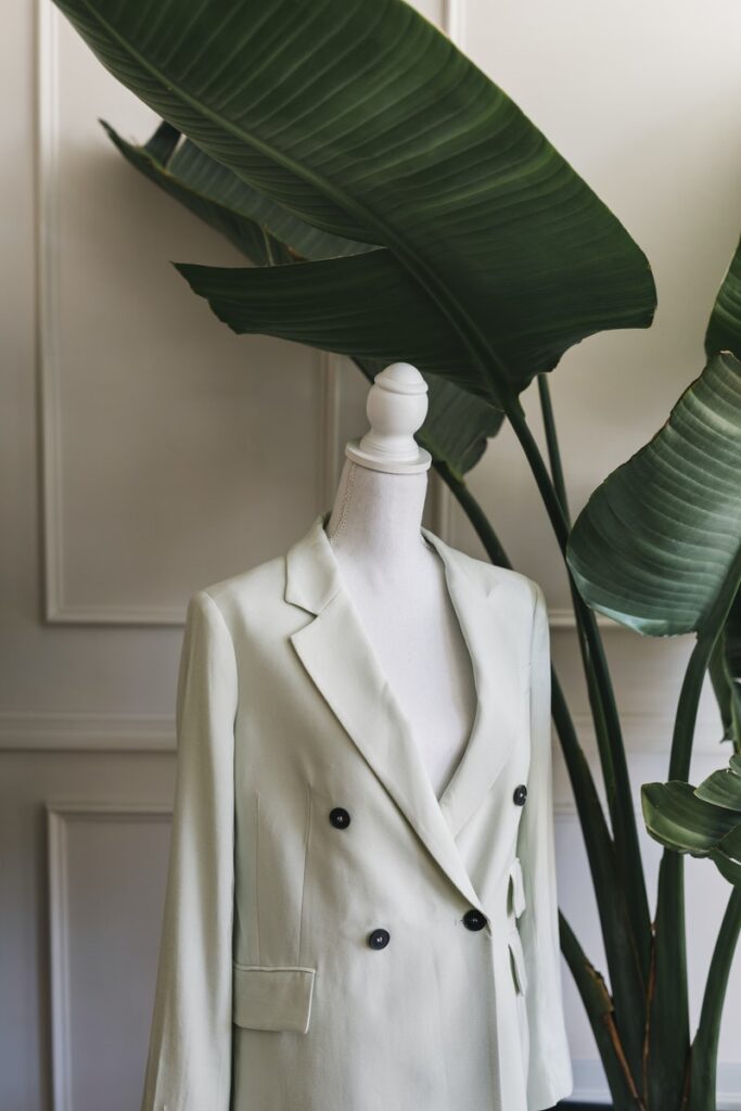
If you choose to use mannequins, as is common for clothing stores, do make sure they appear elegant rather than creepy, the latter of which they can sometimes tend toward. A great tip would be to dress it as you would a real-life model, complete with accessories, rather than simply showing off the top half, for instance, whilst the bottom is left nude.
This right here is your advertisement, your TV commercial, your billboard, your radio jingle, all rolled into one, in physical form; make it count.
SEATING
No customer wants to feel rushed, and to evoke that sense of luxury which results in a bigger spend, you want to give visitors to your boutique fashion store the illusion of time. This can be done through your seating, carefully positioned to give the consumer a rest and a ponder, or more likely, allow their bored significant other a chance to check their phone.
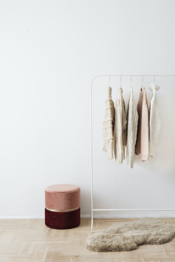
Pouffe seats and ottomans are great choices for seating, as they are stylish, compact, and aren’t so comfortable that customers sink into them for too long. Ottomans can double up as discreet storage units, too; ideal for those stores on the smaller side.
Of course, seating is a necessary courtesy towards elderly people, expectant mothers, or shoppers with special needs, and it’s your duty to install some.
STORAGE
For storage on the front end of the store, a mirror glass chest of drawers adds elegance and provides you with the easiest way to display items clearly. The top of the chest can double up as the check-out or even a display surface when space is at a premium, too.
You may need to have storage units custom-made for your space. Do insist on quality work since having wonky shelves or needing to fight drawers open in front of clients can be embarrassing and damage your brand’s efforts at harnessing that sense of luxury we spoke about earlier.
In fact, for bespoke drawers, it would be advisable to consult drawer slides manufacturers for custom slides that fit right. Every physical interaction with your space should be seamless, smooth and graceful, to imbue every single movement with trustworthiness and strengthen loyalty.
THE LITTLE THINGS
You can tell a cheap suit from its stitching. In the same way, if you use inputs that are below par to hold your store together, it will show. The point is not that you should splurge unnecessarily but rather, insist on quality work and good finishes on all of your boutique’s functional items. The finer details count, and a screw loose here, or some paint chipped there, contributes to a consumer’s overall impression of your offering, however subconsciously. These details really matter in a boutique store which isn’t able to evoke class and luxury via larger-scale marketing campaigns.
THE BOTTOM LINE
When setting up and decorating your boutique fashion store, you’re not only selling your products. You’re also selling an experience, an aesthetic and ultimately, the quality of your work. Get things right in the early stages, and you’ll guarantee customer loyalty later down the line, which in the end, translates to bigger profits for your business.

