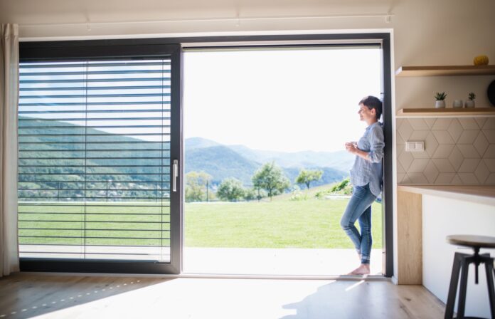
Your home’s hallway is the first place that guests interact with when they walk through your door, and its aesthetic value can make a huge first impression – both good and bad!
However, your hallway can all too quickly become cluttered and messy, from shoes and coats left by the front door, to piles of junk mail and detritus blown in from outside. To help you keep organised and make a good first impression on your guests, here is how to dress your hallway to make a great first impression on guests.
Declutter Your Hallway
As both the entrance and exit point to your home, your hallway is a prime candidate for household clutter. Coats and shoes discarded in a hurry, wet umbrellas drying from the rain, and piles of junk mail all make for an untidy hallway, not to mention debris blown in whenever you open the door causing aesthetic chaos.
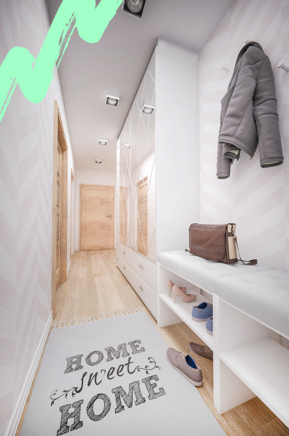
Take an afternoon to thoroughly declutter your hallway. Recycle junk mail and sweep away any dirt. Go through your outside shoes and clothing and donate any that you no longer wear to your local charity shop. You could even invest in an attractive shelving unit to store your coats and shoes correctly.
Consider savvy storage solutions for your hallway, too. Slimline storage units are the way to go; consider using multiples of the Trones shoe cabinet from IKEA mounted together to form one big unit. These units are super thin and fit perfectly in a narrow hallway. Alternatively, a statement piece like the Elona shoe storage unit from Made can look good.

Create A Gallery Wall
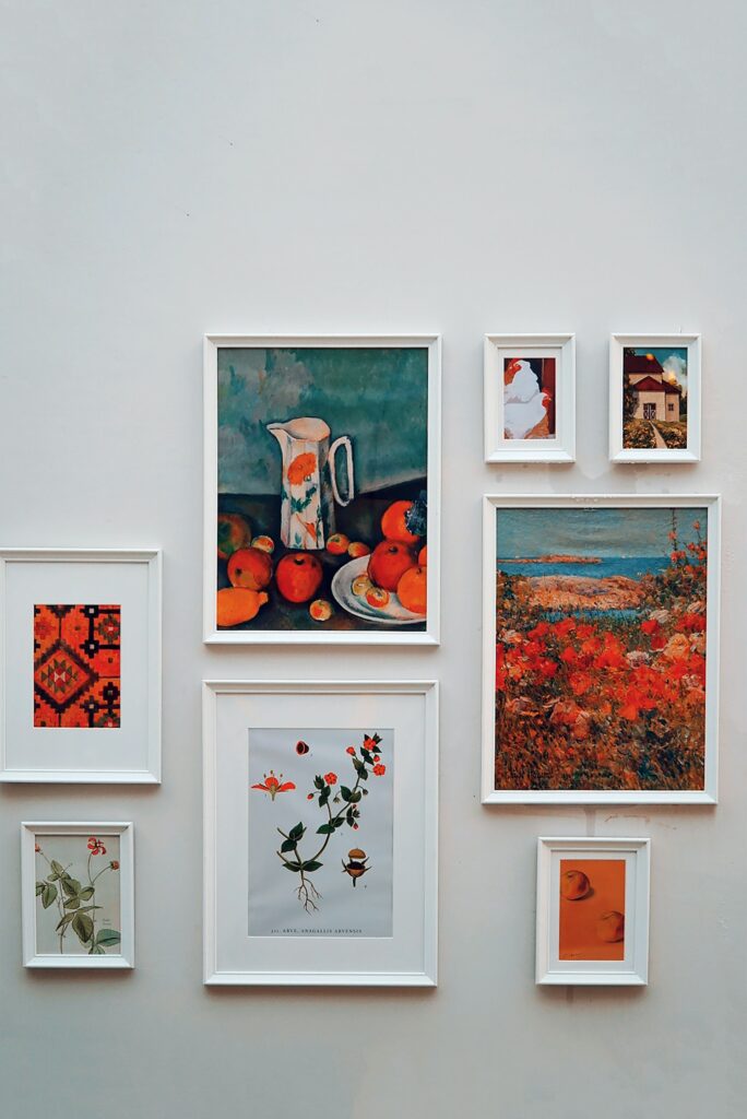
In interior design, a good way to establish the mood of a space is through the use of colour and imagery. If you want to add personality and life, going with a gallery of photos is often a smart move. This looks like real thought has gone into the space, which is always a good look.
A gorgeous gallery wall in the hallway offers a warm welcome to visitors and provides a useful visual cue about what lies within the house. That said, the layout and content of a gallery wall needs careful consideration; without paying attention to the individual elements at play, your picture display wall may appear messy or disorganised instead.
Most hallways are lengthy by nature and offer a narrow canvas for displaying your framed art or photos. Traditionally, gallery walls are designed to remain square or rectangular in formation, but this is by no means an actual rule set in stone. For example, creating a diamond shape formation is just as effective while also adding visual interest that would otherwise not exist.
Frame Your Art In An Interesting Way
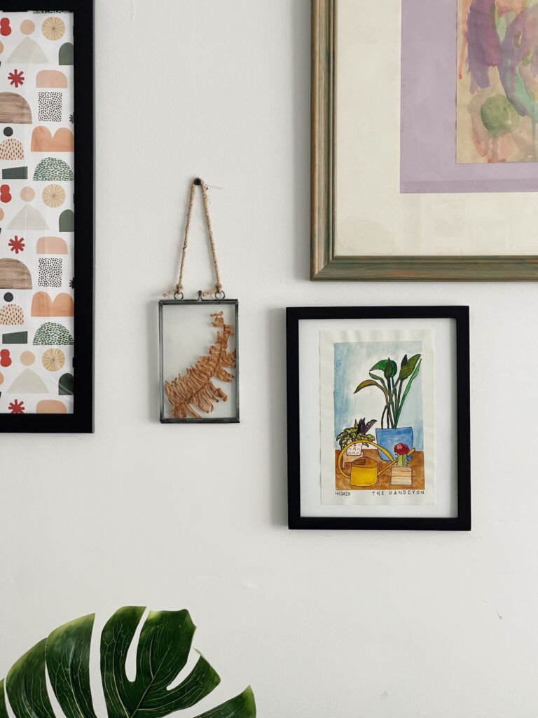
Though it is important to have a common theme for your display, it doesn’t mean that you can’t add interest. For example, you can mix and match different frame styles, textures or even designs to get a wholly unique and curated look. The idea is to have a common theme running for your pictures such as black and white, sepia toned or to only display watercolours.
Once you establish what that theme is, don’t be afraid to experiment with different frame sizes, lengths, and orientations. It is always a possibility to include some collage picture frames to help you organize smaller pictures while still keeping in line with your display.
Of course, the beauty of a gallery wall lies in the unexpected. You can create dimensional pictures for your hallway by employing the use of shadow boxes and randomly placing them between your selected frames. These boxes are ideal for displaying trinkets and treasures that are unique and personal to you.
Read: How to frame, hang and display your artwork to catch the attention of guests
Lighting
Your hallway can be a dark and dingy place without adequate lighting. Not only can this be unwelcoming for guests, but you may find it intimidating to return home late at night and be faced with a dark hallway. Choose a ceiling light, such as a pendant light, with an expansive light range to illuminate even the darkest corner.
You could also supplement this with a freestanding standard lamp to provide a softer source of light throughout dark evenings and dim mornings. You could even install a system of smart lightbulbs that you can control via an app, allowing you to lighten up your hallway remotely before you and guests enter it!
Fine Tune Your Focal Point
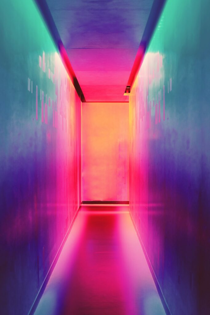
A focal point is often the most important and under-appreciated aspect of interior design, or so say the British Academy of Interior Design. And while it may sound a little generic – obvious even – the sentiment makes sense; the focal point is normally what you notice first when you enter a space. And first impressions count.
So, ensure your hallway has one that’s in keeping with the overall aesthetic, both of the passagement and of your home’s overarching interior design. A simple ornament at the end of the hallway, an art deco clock face, or even an intricately framed mirror reflecting the beaming faces of entering guests, all does the job here.


