If the last few years have taught us anything, it’s that dull, downbeat colour schemes have no place in the domestic setting anymore, however much the beige-fluencers will insist otherwise. Life is short, and it’s not to be lived muted. Now, paint that picture in vibrant, vivid shades, to signal a sense of optimism, even in turbulent times.
Fortunately, gone are the days when people were hesitant to apply a shade of orange or green to their living room walls. More and more people are now incorporating these bold colours to break the monotonous look of their living room and liven things up a bit. So, if you’re planning to re-decorate your living room, how can you play around with colours? Here’s some top tips on how to use a bold colour scheme in your living room.
The Psychology Of Colours
Many believe that the mere presence of colour in a room could affect the behaviour of its occupants, or at least, influence their mood. Because of this, the psychology of colour is used in a variety of industries, and it plays an integral role in many interior design decisions.
For example, the colour red is often used by interior designers in the kitchen since it apparently makes you feel hungry. This might be why you’ll find red and its variations present in the design of many restaurants. Meanwhile, orange and yellow are associated with joy and sunshine, which make them great colours for the living room. Then there’s blue, which people generally associate with calmness and tranquillity. As such, people use this colour for their bedrooms.
What’s more, the shade of the colour also affects how it’s perceived. Take orange as an example. Although it’s typically associated with joy and energy, dark orange is deemed as a symbol of deceit and distrust. Dark green can evoke feelings of groundedness while lighter shades of green are commonly used as a symbol of healing and protection. Play with colours carefully, is surely the lesson to be learnt here.
But how to deploy a striking colour scheme with dexterity?
Bold, Not Loud
‘Bold, not loud’ should be your mantra. Although you want to draw from a striking colour palette, you’ll want to avoid anything which could be deemed upfront, aggressive or worse, termed ‘shocking’.
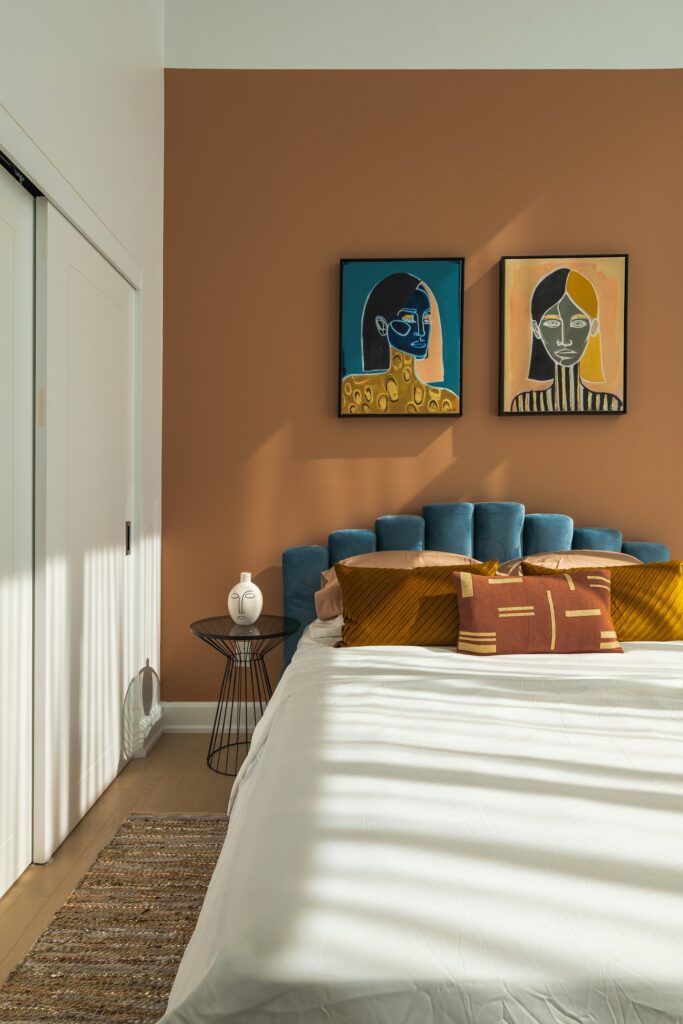
This is where those all-important nuances of shade come in. Should you have your heart set on a particularly bruising colour, consider dialling it down a notch. Shocking pink might look great on Megan Thee Stallion, but perhaps less so on your walls. A feature wall in Baker-Miller pink or a mauve purple, on the other hand, would set the tone for a sense of soothing serenity in your living room’s interior design. It’s all about refinement and distinction here.
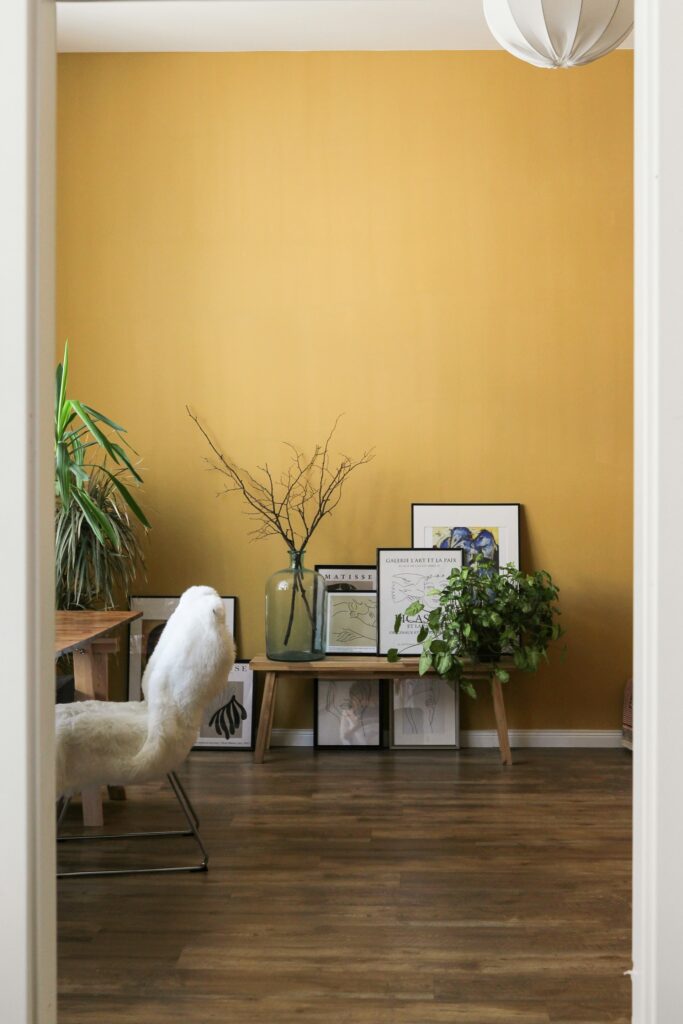
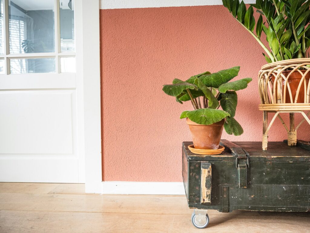
Painting Smaller Rooms
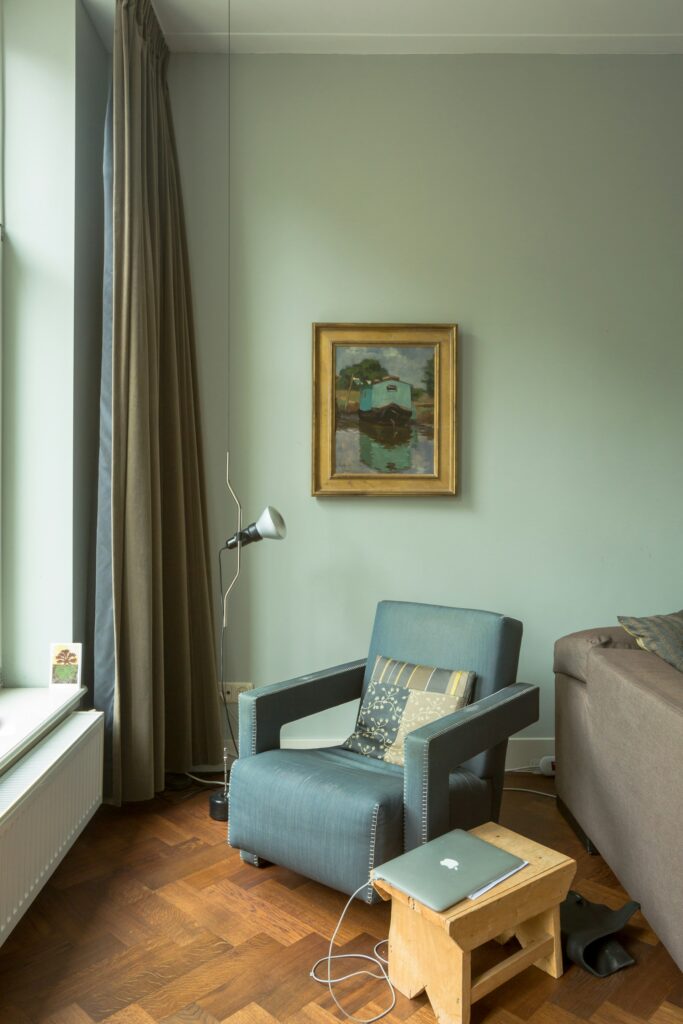
If your living room is small, you’ll want to do the exact opposite: paint your walls in a lighter colour, with a white or off white the best option here. This will give the illusion of a bigger, more expansive space.
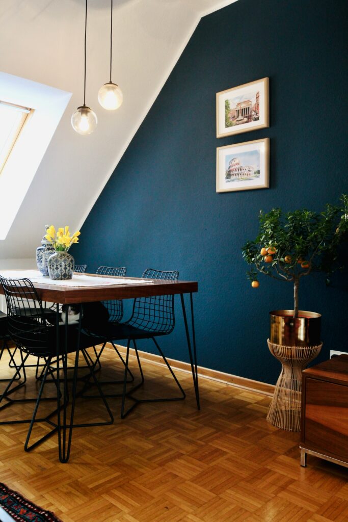
But such a paint choice can look clinical and monotonous. Solve this by adding a feature wall, beloved of interior designers and articles such as this one. All this means is painting one wall in the room in a striking, often juxtaposing shade. The feature wall doesn’t actually have to be a solid, single colour; you can incorporate a design, such as an ombre effect of a dark to light shade, or even a tropical print, which is particularly popular with tastemakers today. To synergise the aesthetic, add furniture in a colour which accentuates that feature wall.
Read: Why Italian elegance will be 2025’s biggest interior design trend
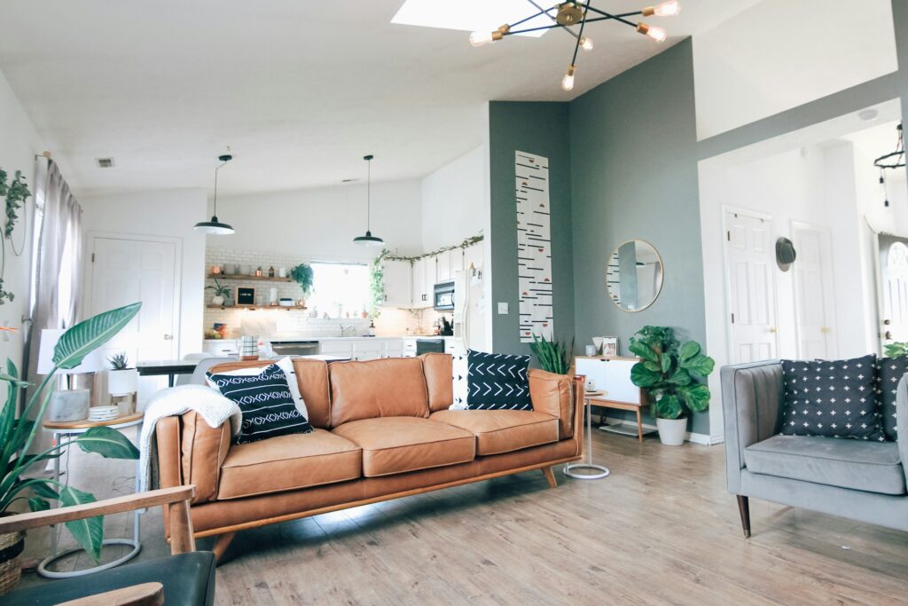
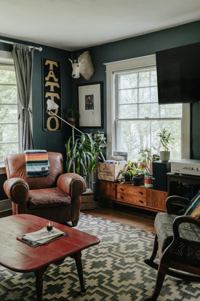
Painting A Larger Room
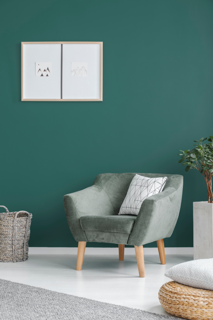
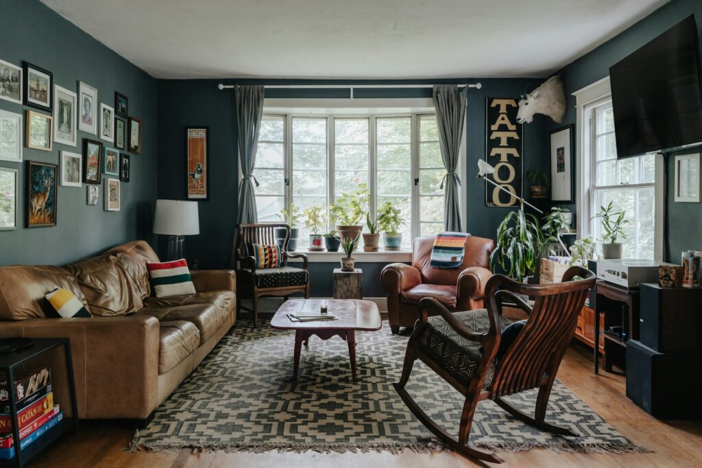
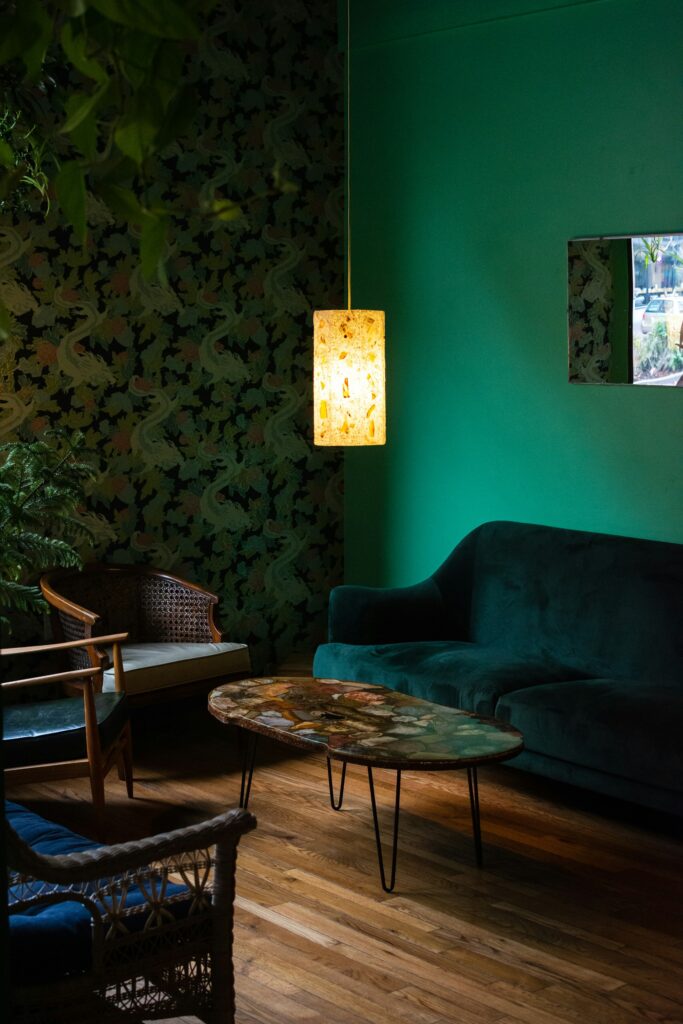
As professional decorators in London My Builder recommend, if your living room is large and has high ceilings you can opt to paint it in a single bold, dark colour. This gives the illusion of a cosier and more intimate space, pulling together disparate, distant elements perfectly, and serving to fight the feeling of emptiness that often comes with larger spaces. Darker colours give a feeling of intimacy and warmth; we particularly love coffee or viridian as the dominant tone in larger living rooms, both of which soothe as much as your morning mug and strike the right balance between bold and refined.
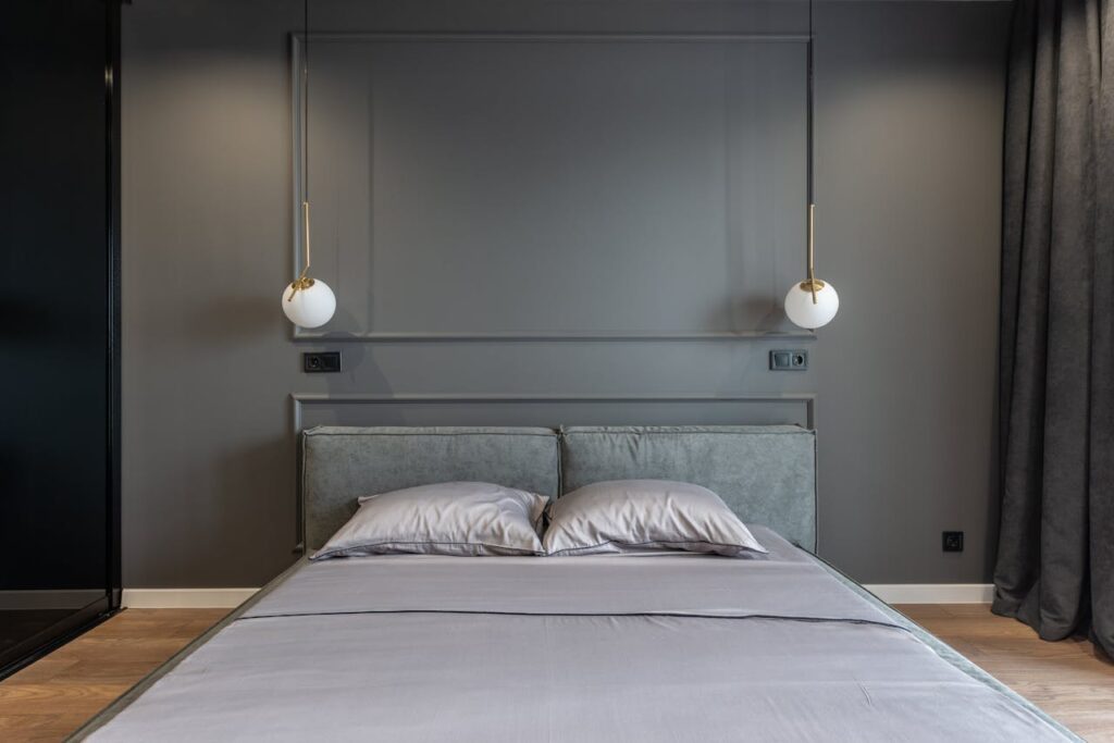
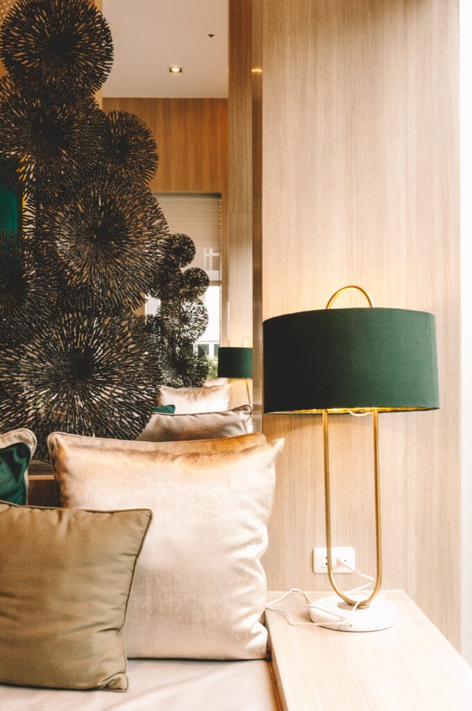
Mind Your Metallic Moments
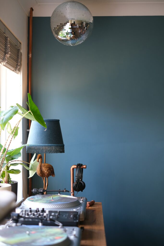
Whilst bold colours command attention, the way you introduce metallic accents can make or break your colour scheme. Copper and brass accessories, for instance, can warm up cooler bold tones, whilst chrome and silver-finished pieces tend to suit rooms decorated in jewel colours like emerald or sapphire. The trick is to use these metallic elements sparingly—perhaps a statement mirror frame, a few picture frames, or carefully chosen light fittings. Remember, these metallic touches should complement your bold colour choices rather than compete with them for attention.
Layer Your Lighting
A boldly coloured room demands particularly thoughtful lighting to showcase its personality throughout the day. Natural daylight will reveal your chosen hues in all their glory, but as evening draws in, you’ll want to consider how different types of lighting affect your colour scheme. Layer your lighting with a mix of pendant lights, wall sconces, and strategically placed table lamps. Warm white bulbs tend to enhance warmer bold colours like oranges and reds, whilst cooler LED lighting can make blues and greens appear more vibrant. Don’t forget dimmers—they’re invaluable for adjusting the mood and allowing your bold colour choices to shine at any time of day.
Make Sure Bold Really Is Beautiful
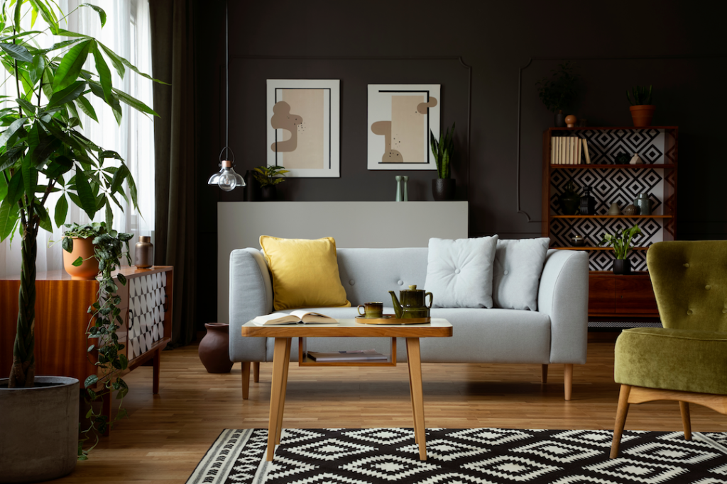
There’s no point painting your living room in a particularly striking shade if the room itself doesn’t match the bold colour scheme’s ambition. Apart from pairing furniture to the walls, as we mentioned, it’s important to make sure the aesthetic of the room as a whole is working in harmony and the disparate elements are complementary.
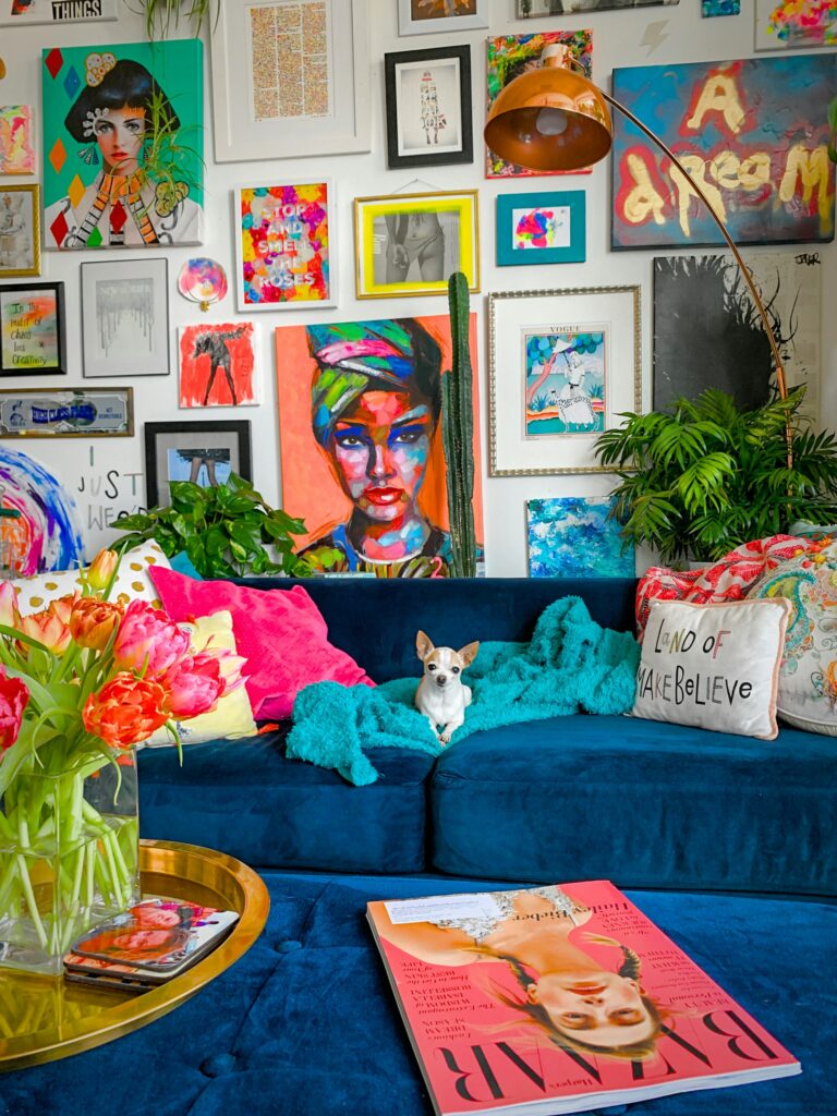
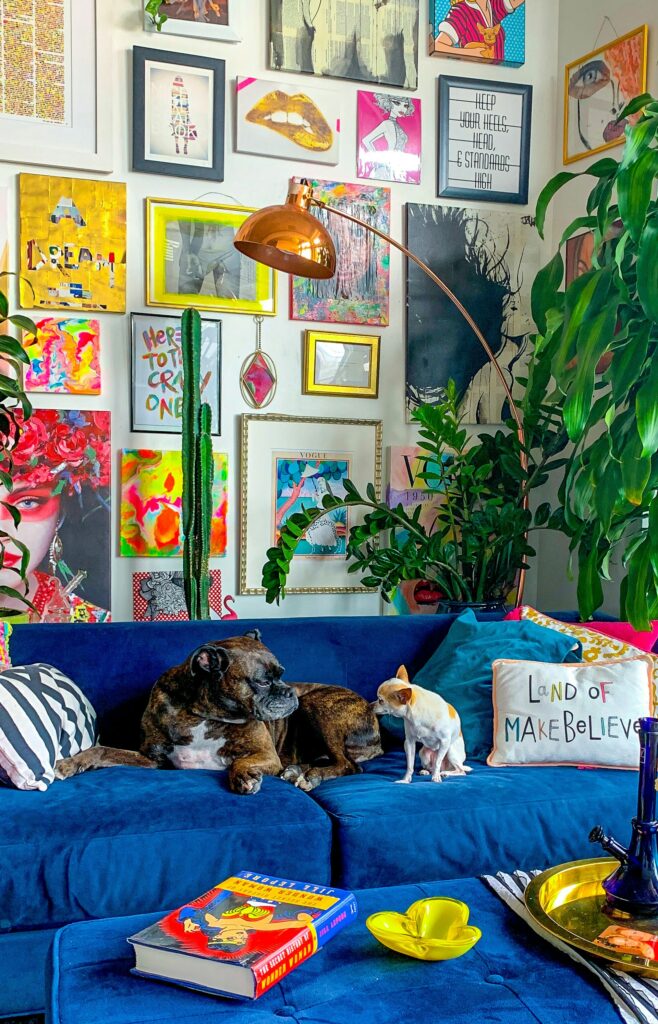
One way you can pull the look of the room together and make it appear concordant is by choosing artwork which features splashes of the same bold colour palette that you’ve chosen for the walls. Rather than witter on, we’ll redirect you; here’s 8 tips for choosing the IDEAL artwork for your living room. We can’t wait to see what you do with the place!


